
Reveal / Heirloom House exterior
This was such a special project to work on – a home that had been in one family for generations. The home had belonged to my client’s mother, and the restoration was in her honour. So it was layered with decades of memories and stories, and we wanted to future-proof it for all the new memories to come. The family’s Dutch heritage subtly influenced the direction – they wanted calm spaces, strong proportions, beautiful natural materials and natural light. Jones Architects drew new plans with a floorplan to support how the family lives today - generous, practical, and welcoming – and builders were tasked with the transformation with SF Studio working with them to execute the interior and spec exterior palettes too.
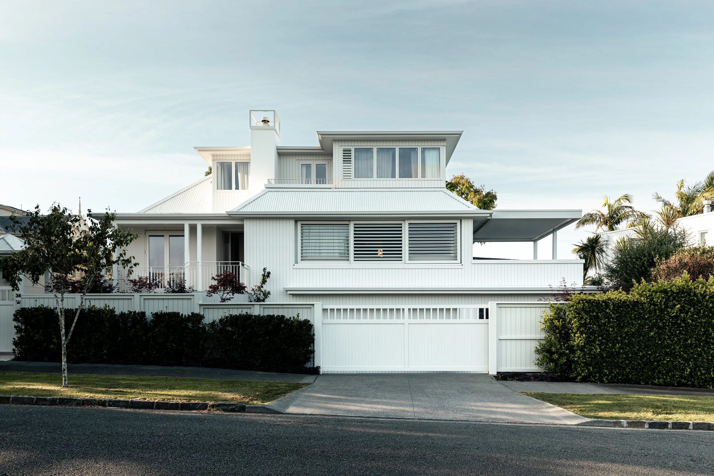
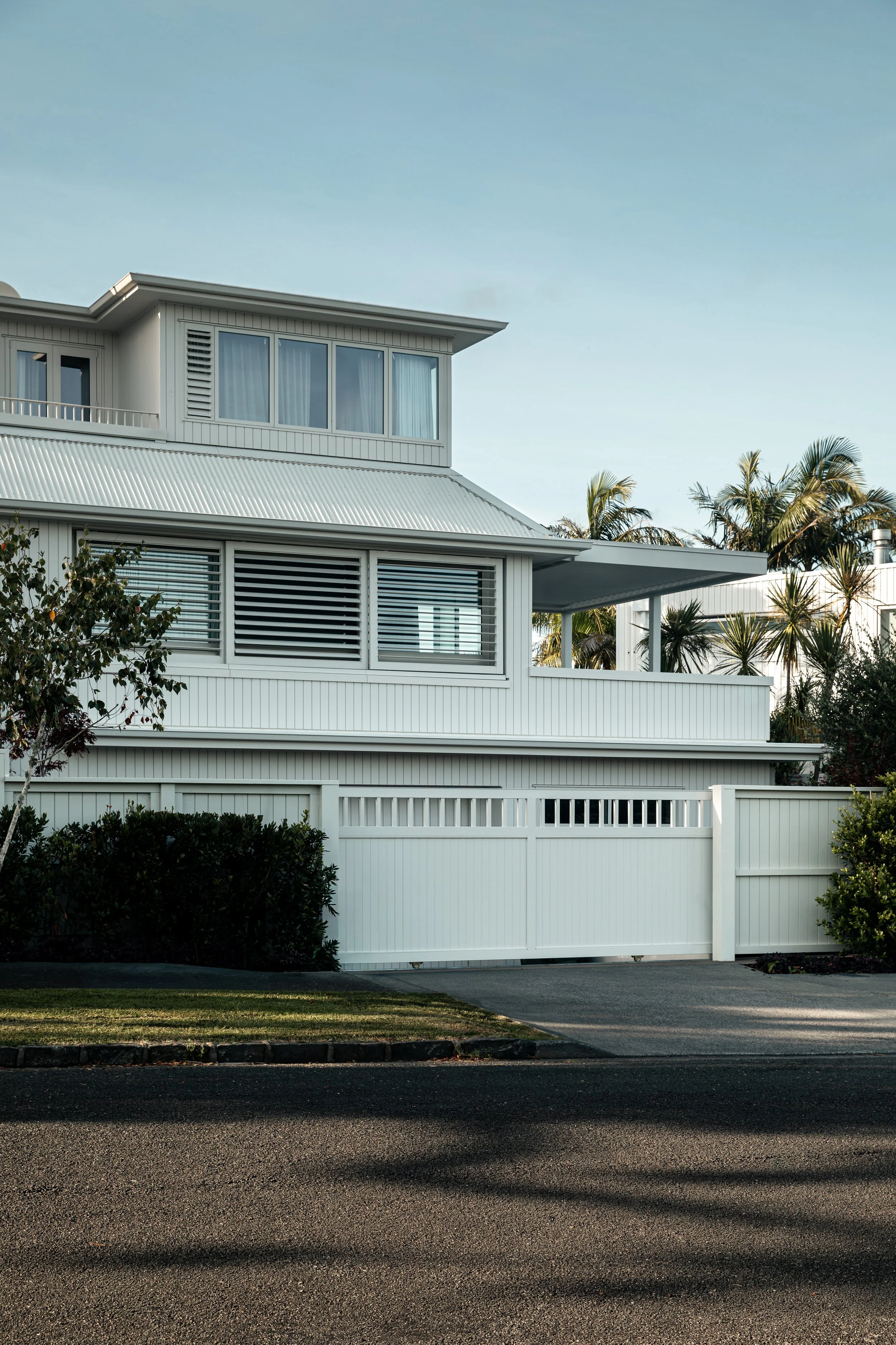
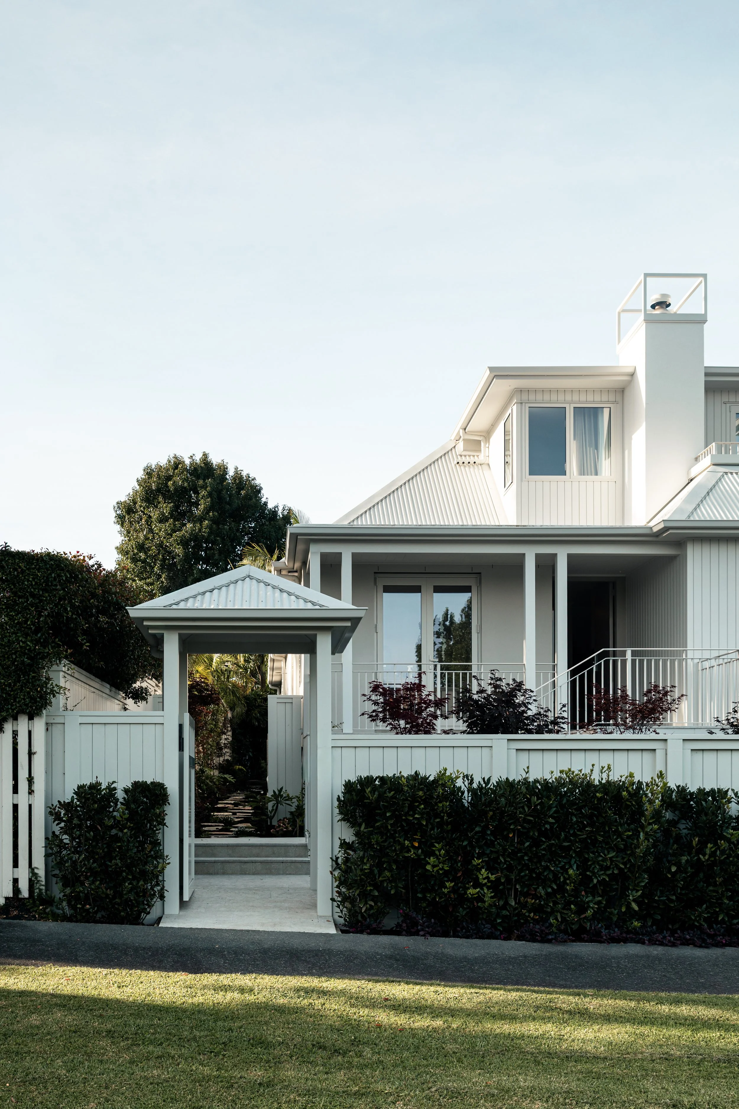
House Frontage
The exterior of this home sets the tone for everything that follows inside - calm but confident, modern but inviting. The palette is airy and timeless, allowing the form of the house and the surrounding landscape to take centre stage. Soft layers in the garden ground the architecture and give the home a sense of permanence and ease. The SnowStone roof and matching gutters keep the exterior tonal giving it a more modern look.
“The garden is beautifully, imperfectly perfect - and walking through it feels like being led on a small, unfolding journey.”
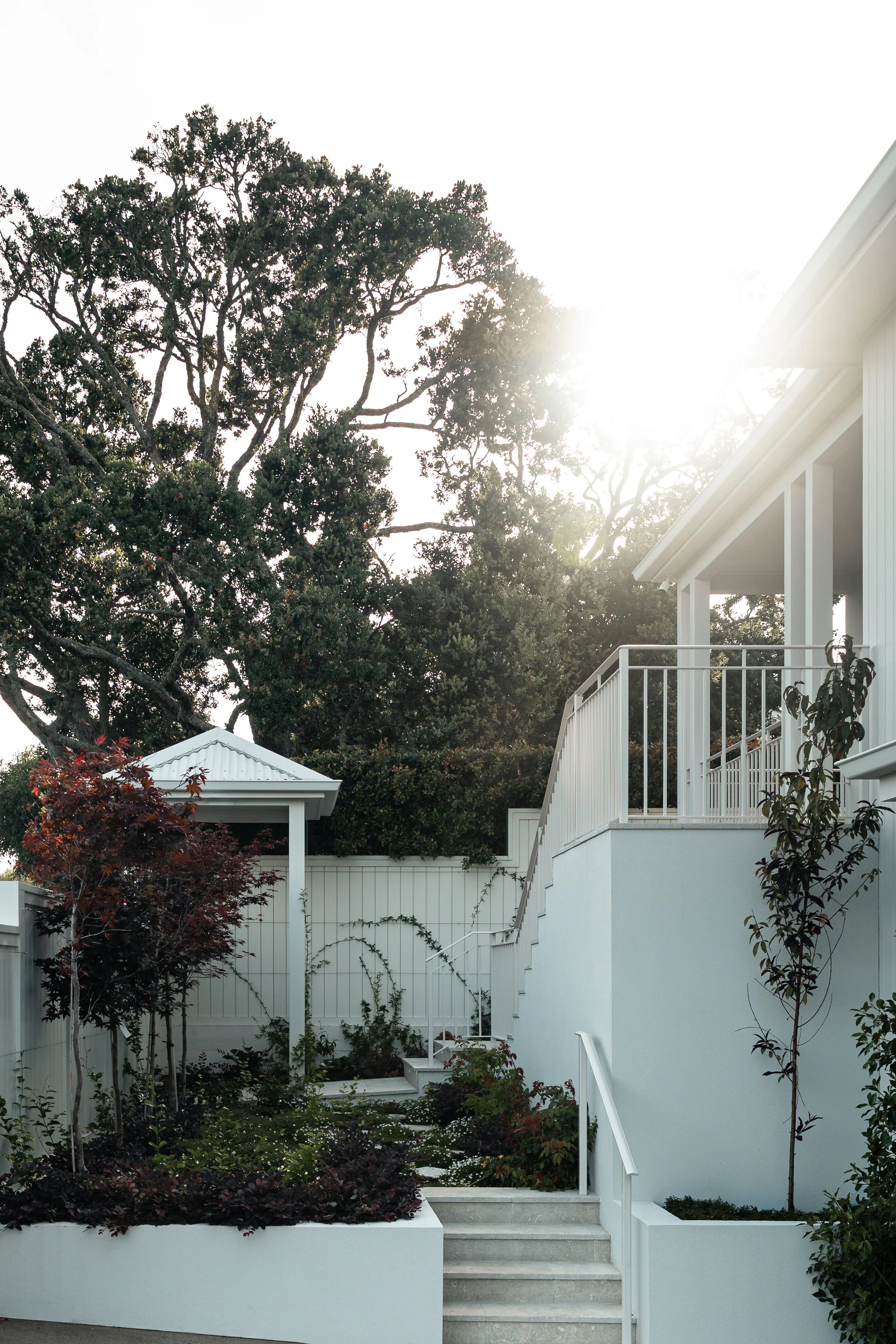
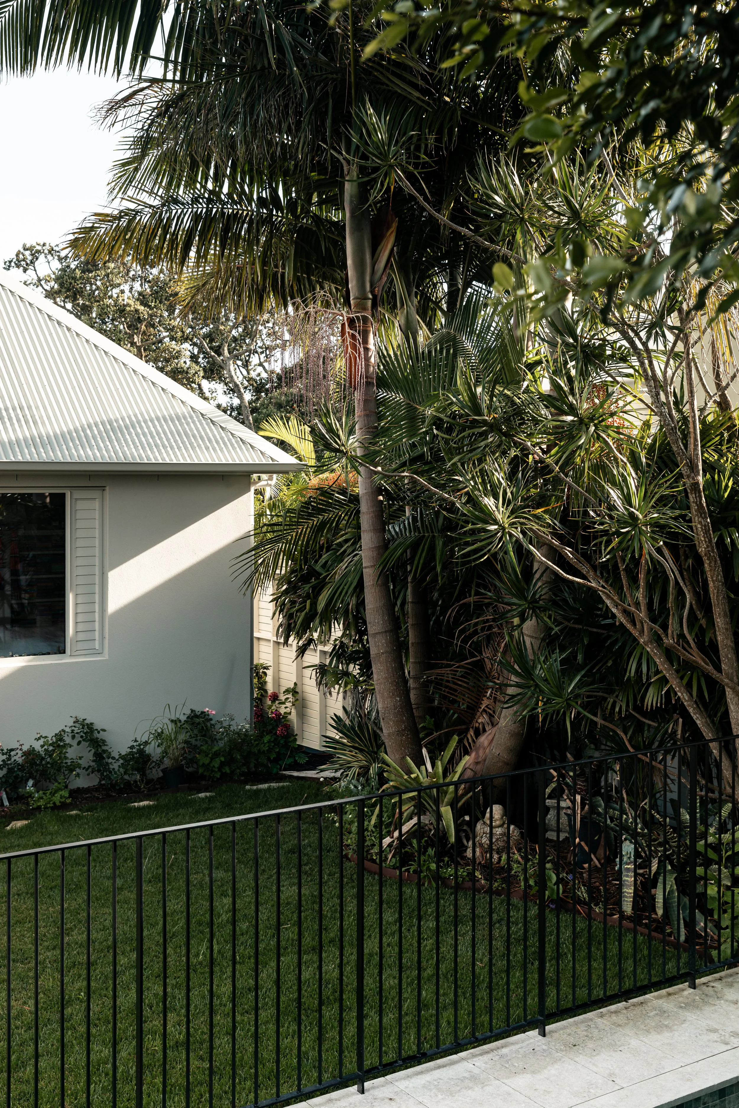
Back yard
The back of the garden is tropical and celebrates lush foliage that has been growing for decades. The owner, a passionate gardener, has cleverly designed and implemented the garden herself, layering more lush planting into the existing trees, and implementing a visually interesting ground cover layer including mosses, flowers and low lying plants. She hasn’t forgotton the vertical faces, growing lovely creepers and mid level shrubs so you get a sense of being surrounded in green.
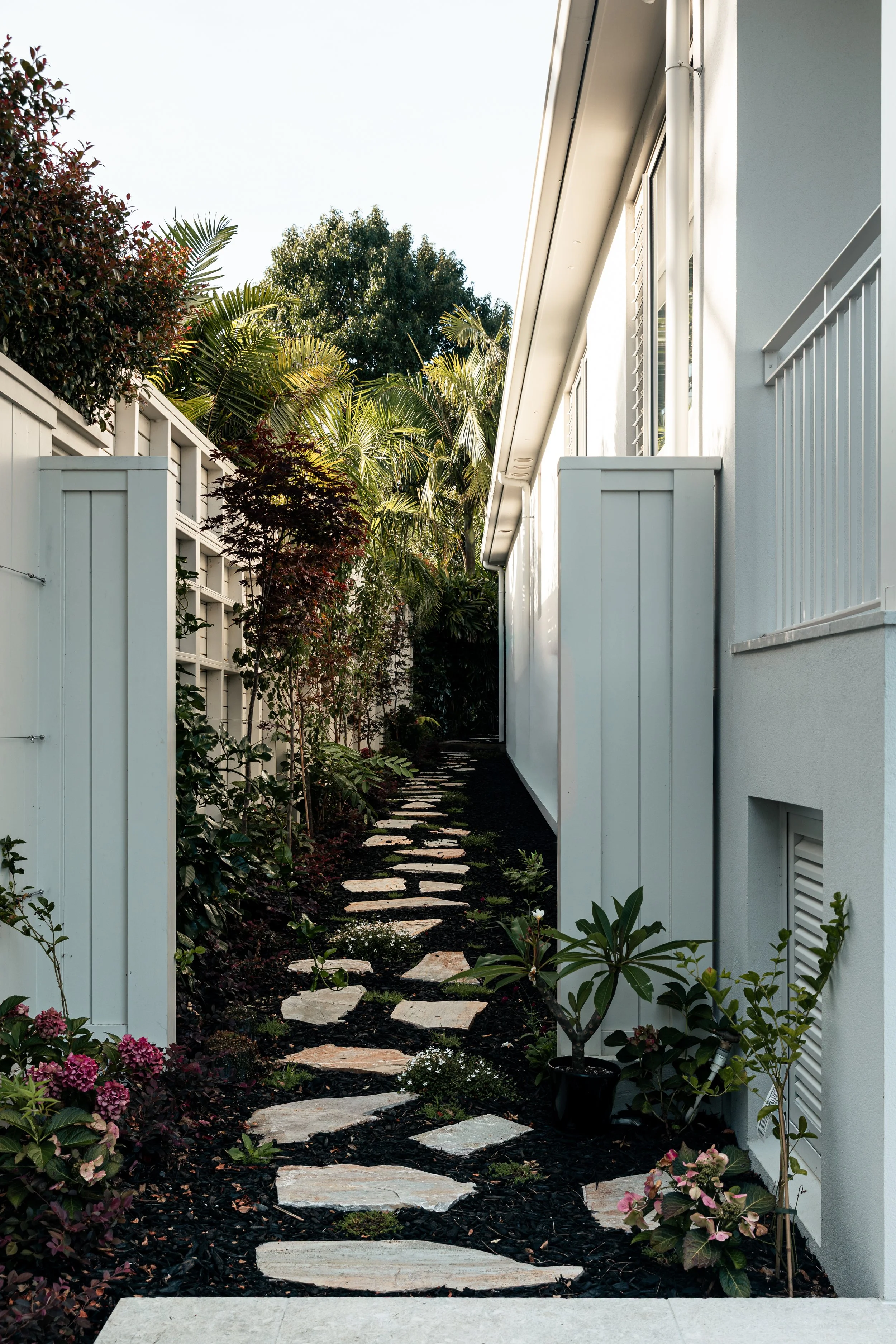
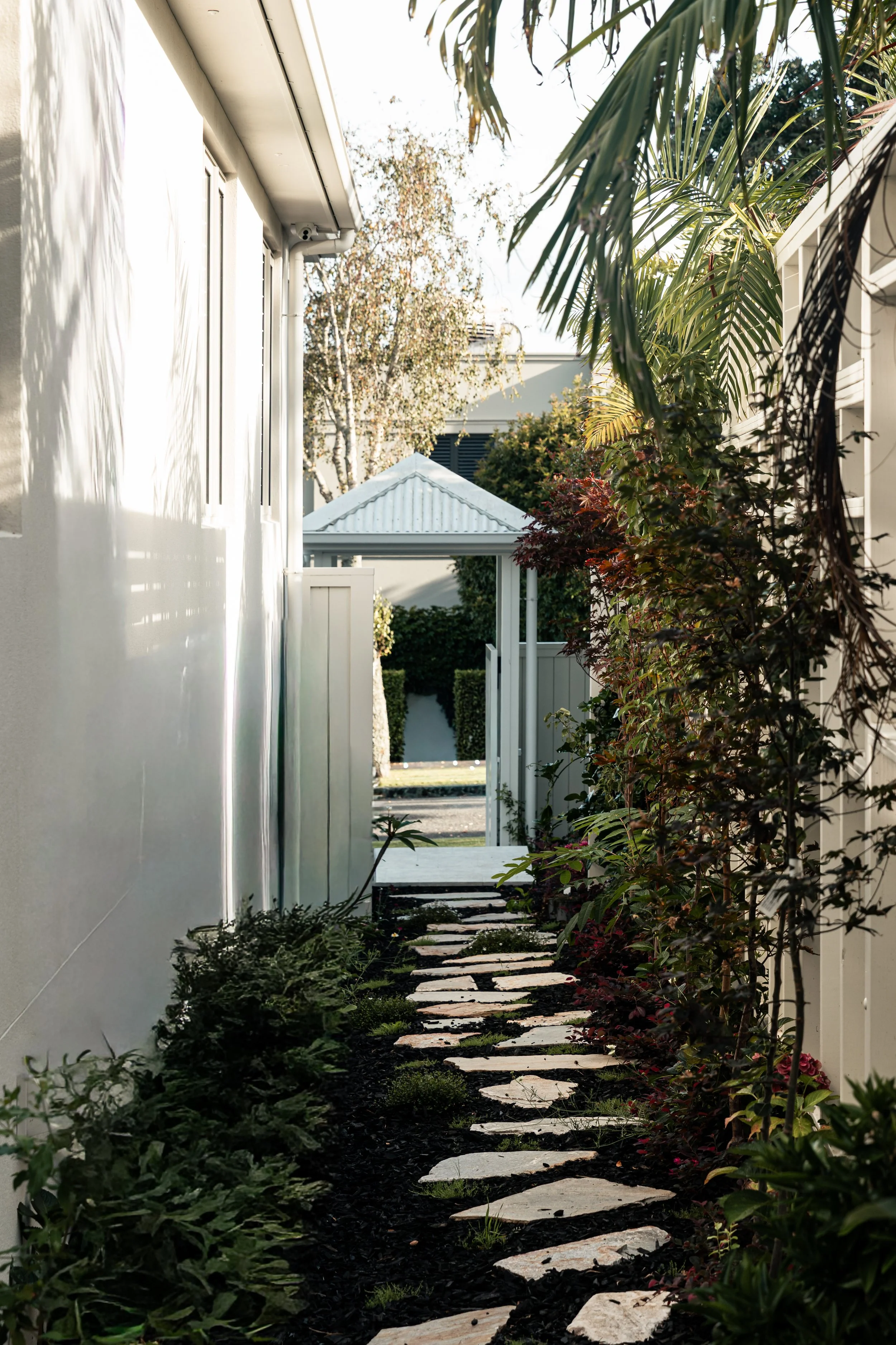
Gardens
The garden is beautifully, imperfectly perfect - and walking through it feels like being led on a small, unfolding journey. Lush creepers line the fences, softening the boundaries, while quartzite pavers leads you forward, hopping from one to the next as you move around the house. Rather than a sea of green, the garden is punctuated with deep burgundy and red accents - from ground covers to Japanese maples and rich hydrangeas - giving it depth, contrast, and seasonal drama.
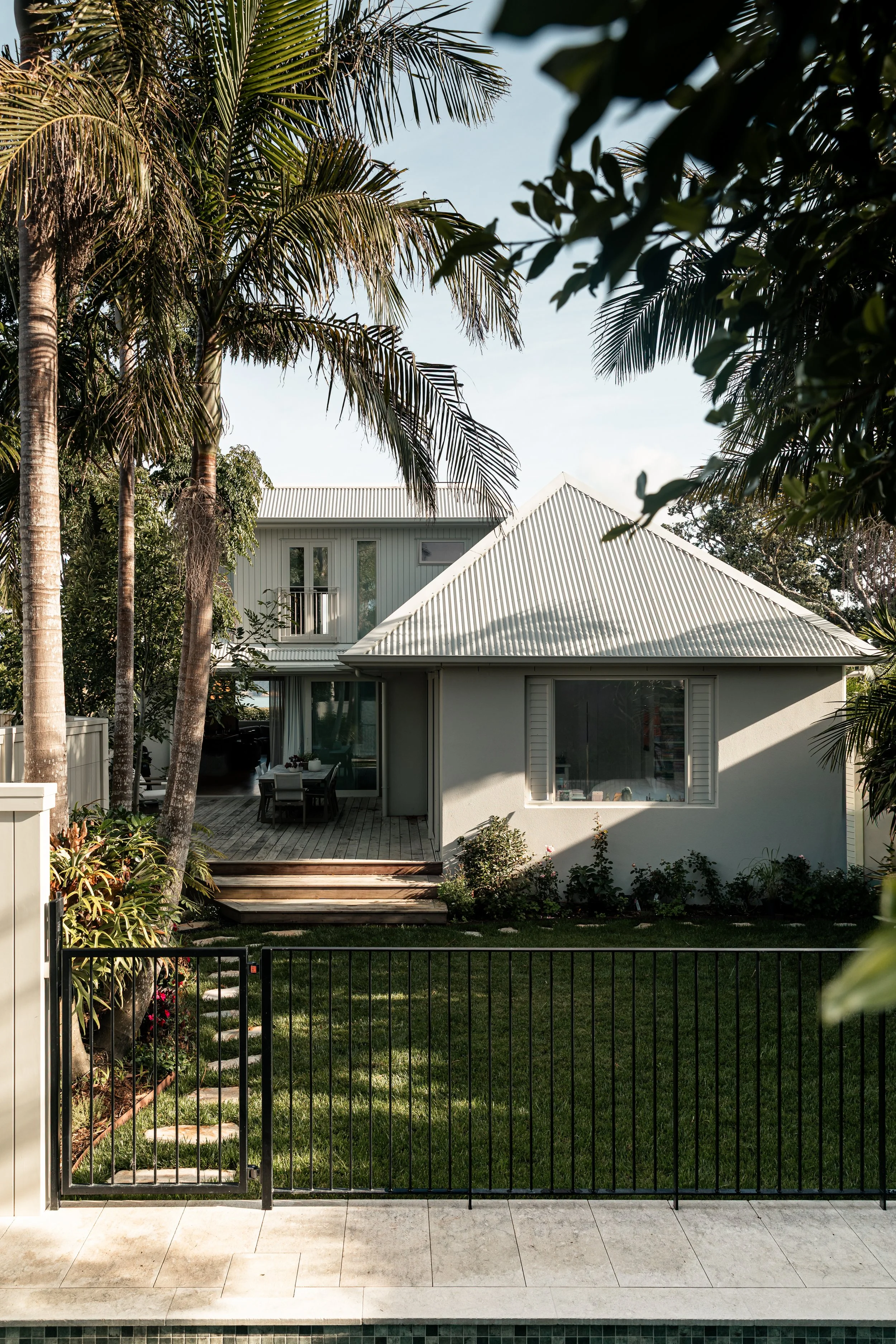
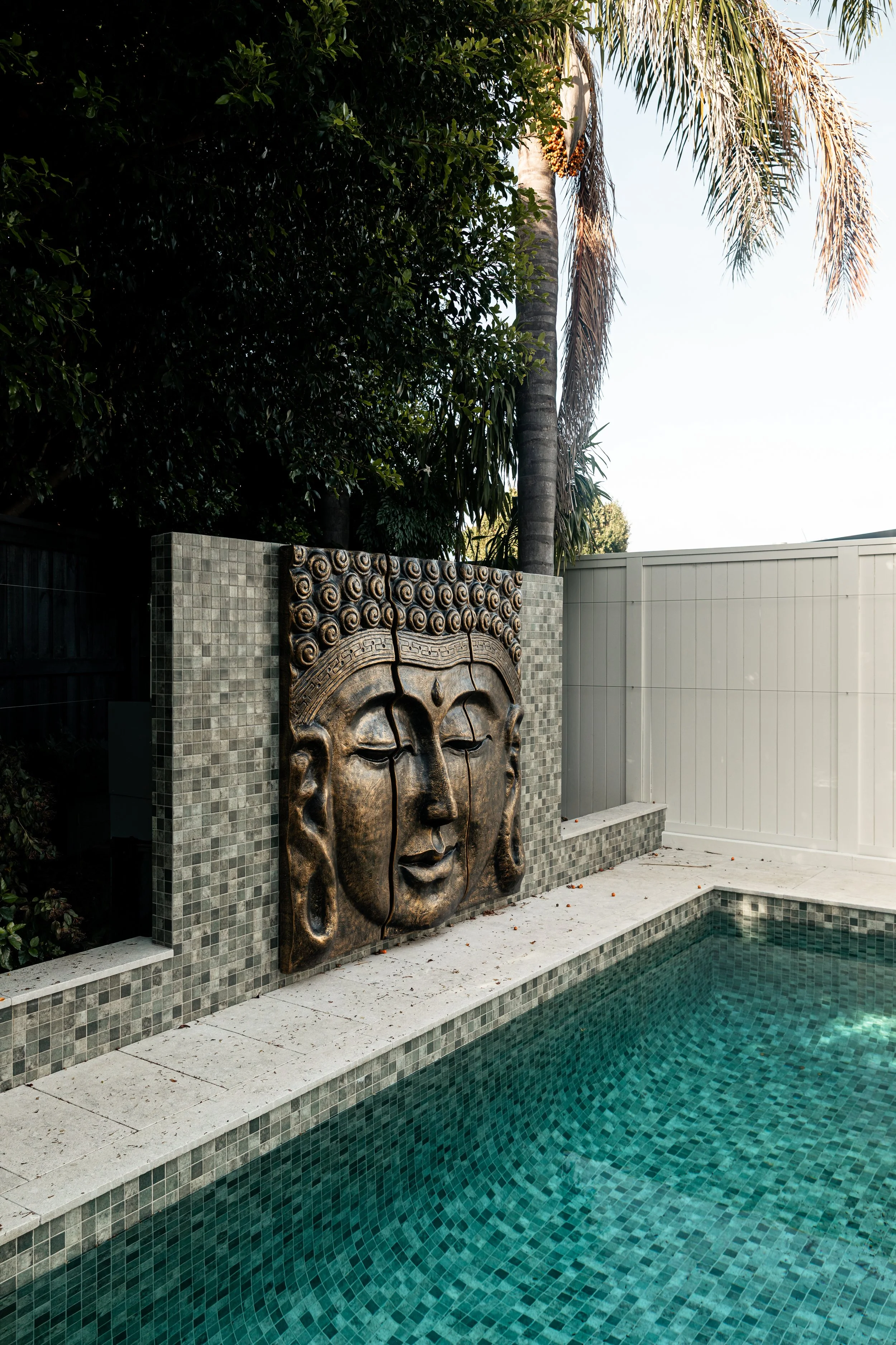
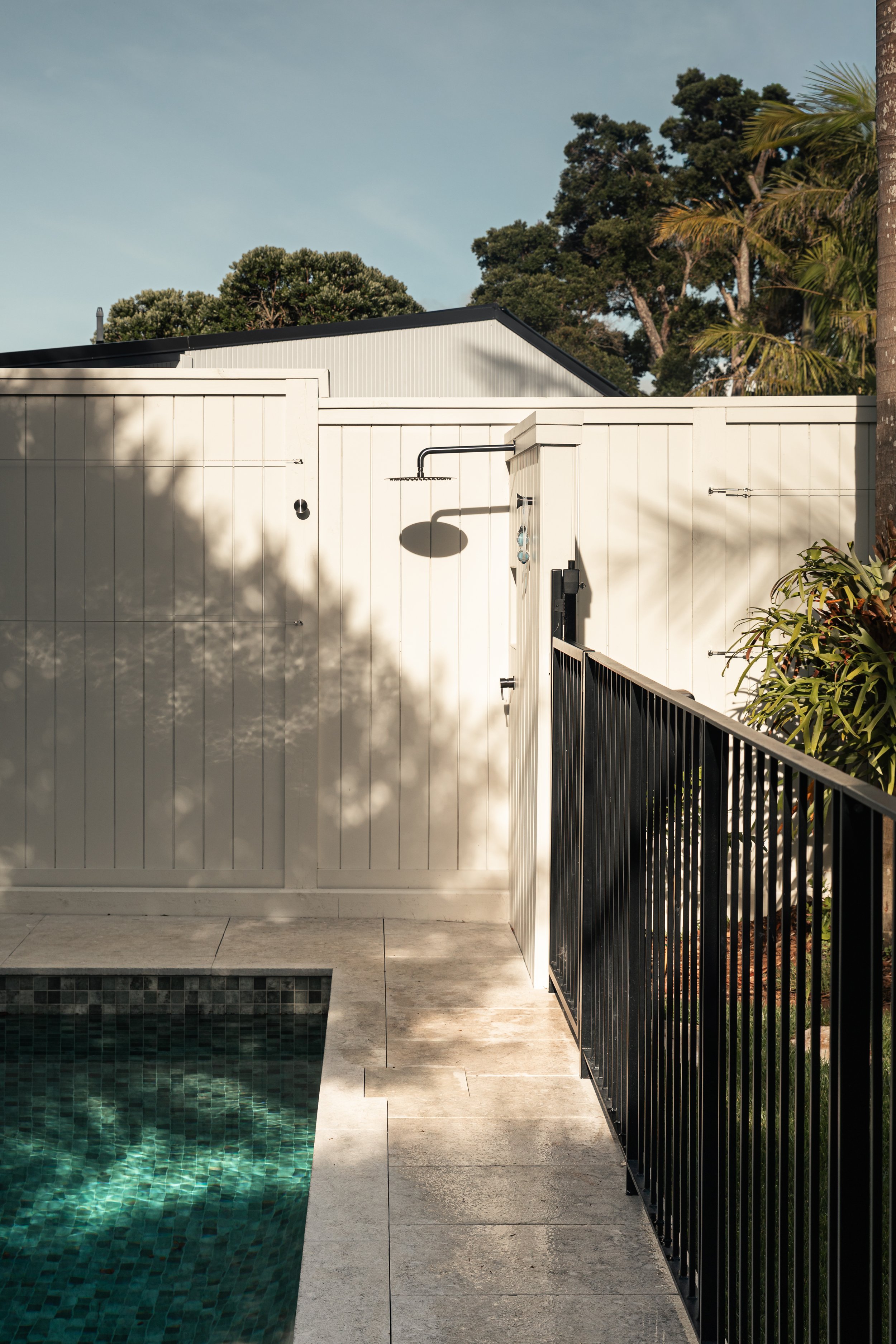
Pool area
The tropical pool area feels like a true retreat, with palms rustling above and around you and sunlight dancing across tiles in layered shades of blue by Tile Tonic. A large gold Buddha stands calmly, quietly guarding the space and adding a sense of grounded energy.
“The garden is punctuated with deep burgundy and red accents - from ground covers to Japanese maples and rich hydrangeas - giving it depth, contrast, and seasonal drama.”
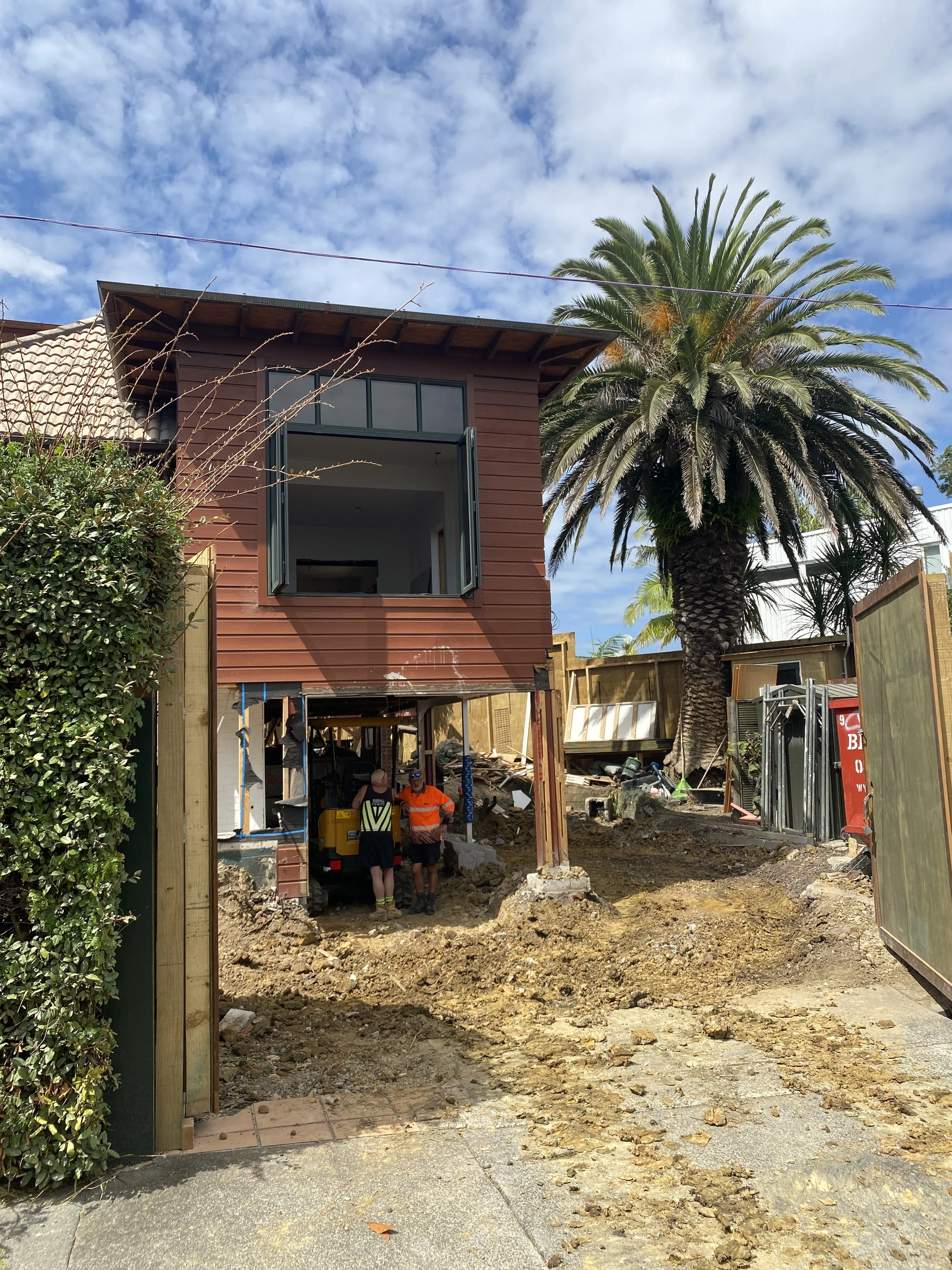
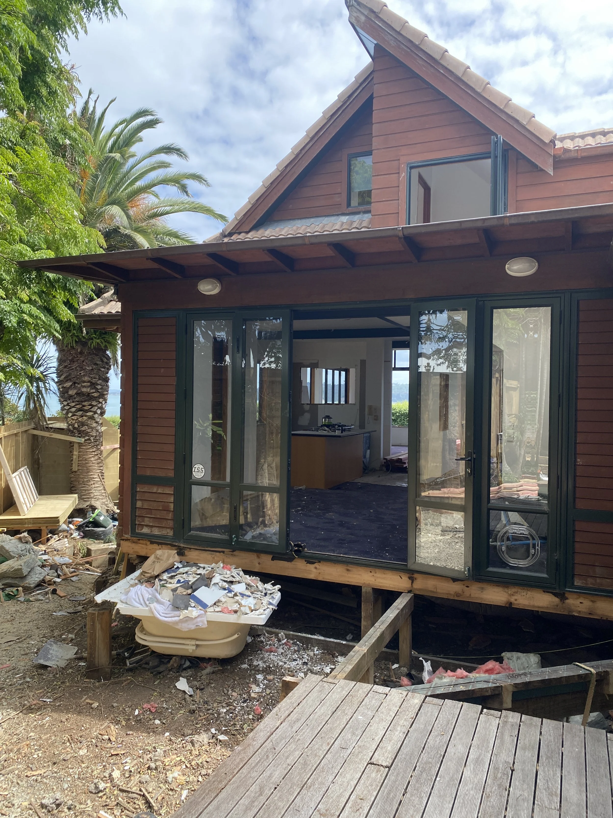
BEFORE PHOTOS
Get the Look
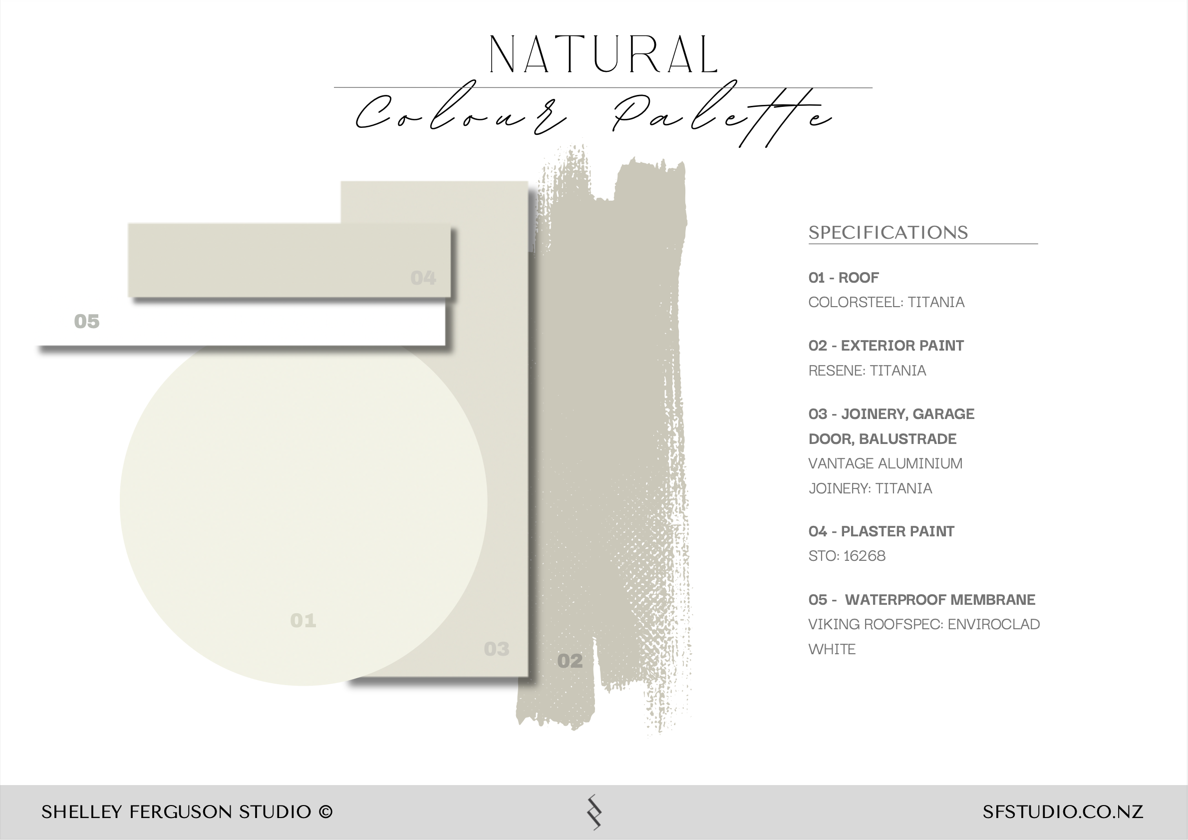
- Exterior paint: Dulux “Narrow Neck Quarter” — dulux.co.nz
- Joinery & balustrade finish: Dulux Powders “Titania”, matte powdercoat — duluxpowders.co.nz
- Roofing: Colorsteel SnowStone® Matte — colorsteel.co.nz
- Gutters & downpipes: Colorsteel SnowStone® Matte — colorsteel.co.nz
- Architecture: Jones Architects
- Builder: Graham Mauger Builders
- Photography: Lilly Smith
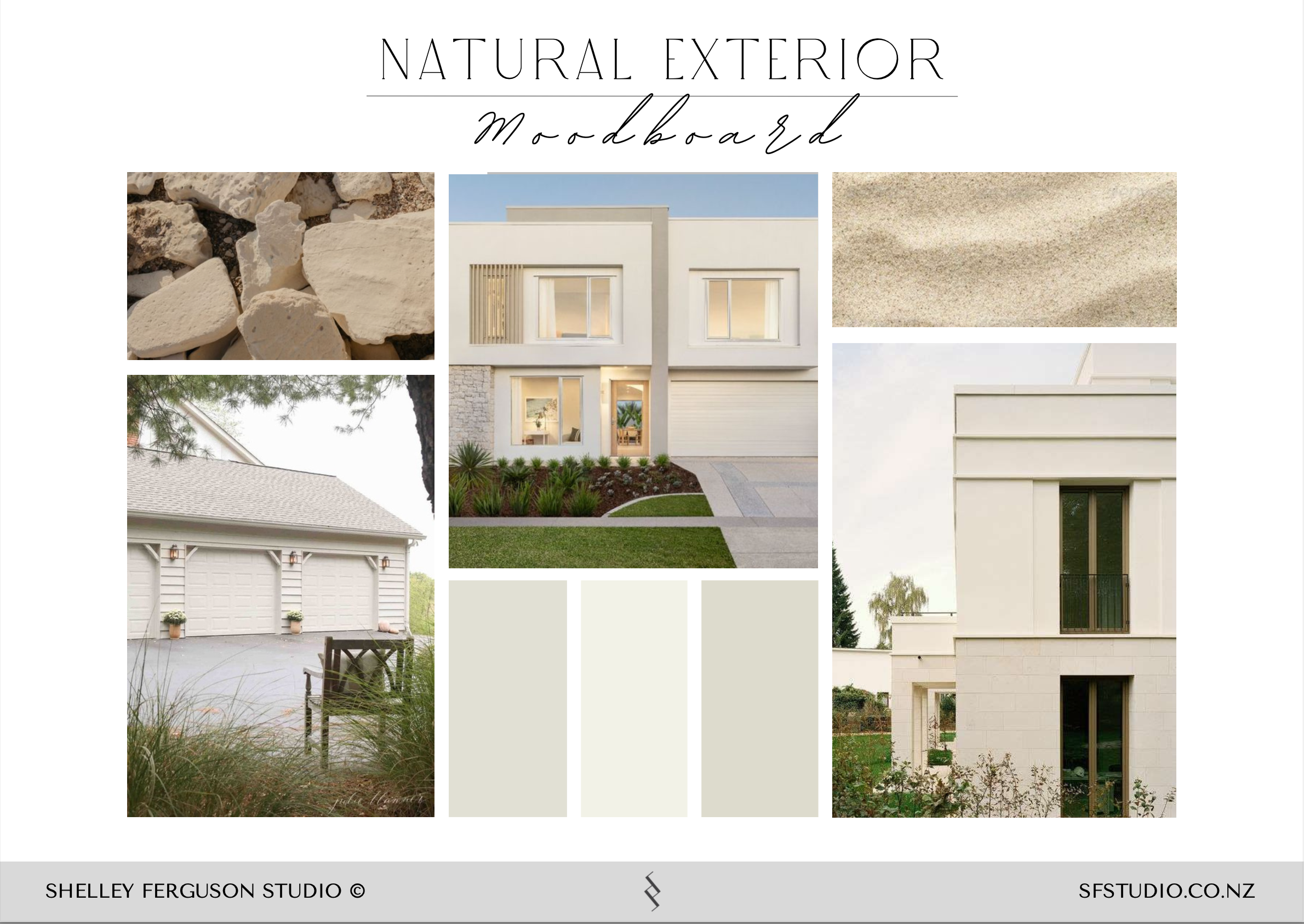
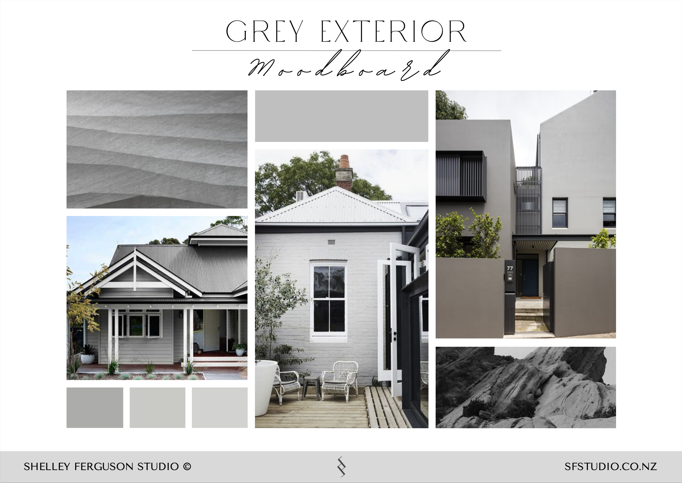
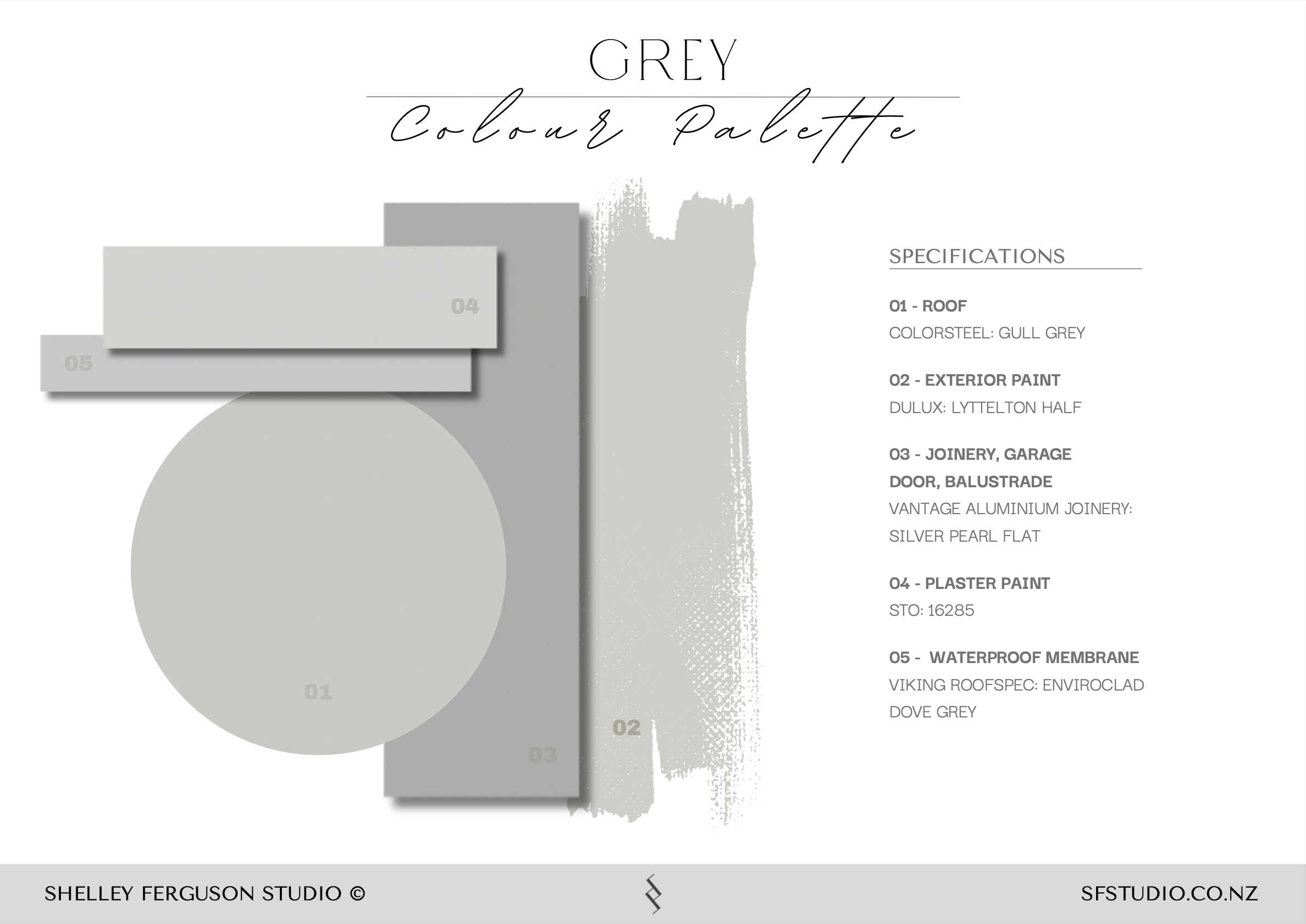
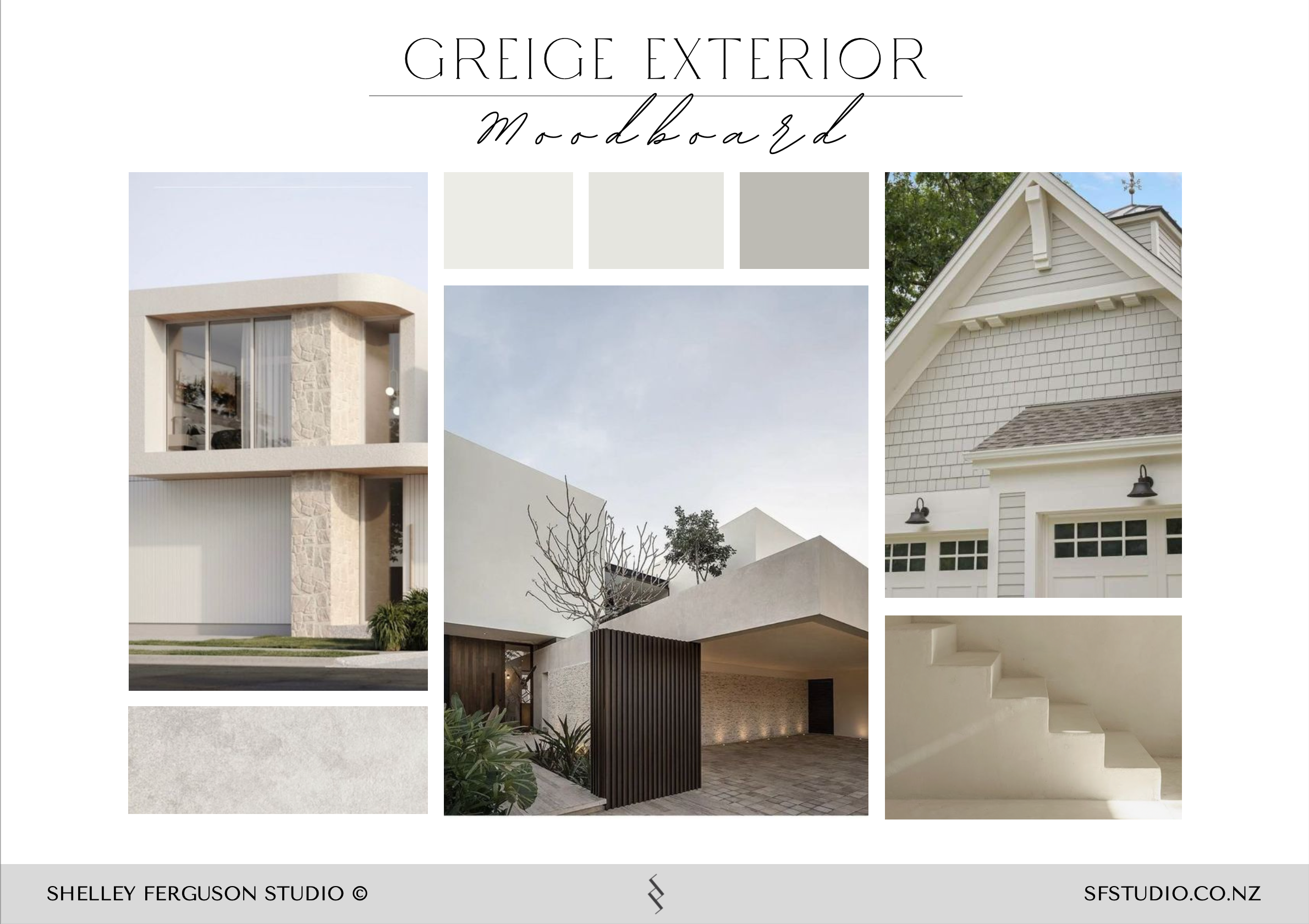
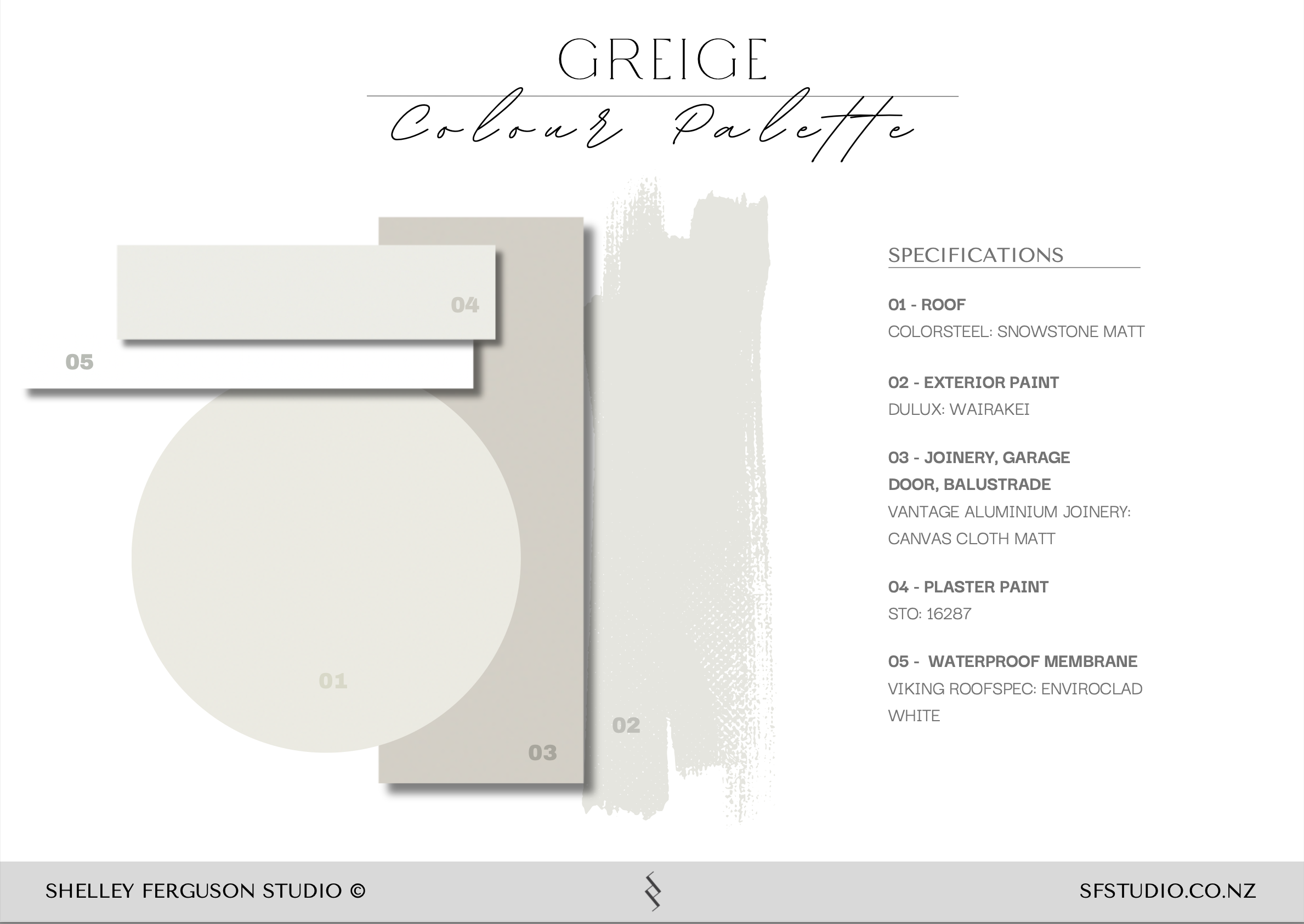
Exterior palettes
Below are three exterior palettes I put together for my clients to consider. We chose the ‘Natural Exterior’ palette and I really love it - it’s light, neutral and soft, rather than too bright and white.
This home is a great example of how a considered exterior palette can quietly elevate architecture and landscape without ever feeling overworked. If you’re planning an exterior refresh or a new build, here are a few principles we always come back to when helping clients choose colours and finishes.
Tips for Choosing an Exterior Colour Palette
1. Start with the setting, not the paint chart.
Before you think about colours, look at what surrounds the house. Is it coastal, leafy, urban, rural? The landscape, light quality, and neighbouring homes should all inform your choices. A great exterior palette feels like it belongs to its environment, not like it’s been dropped in from somewhere else.
2. Let the architecture lead.
The era and style of the home should guide the palette. Heritage homes often suit softer, more nuanced colours, while contemporary architecture can carry cleaner contrasts. Think of colour as something that supports the form of the building, not something that competes with it.
3. Think in materials, not just colours.
Your palette isn’t just paint. Roof, gutters, joinery, front door, stone, paving and metal finishes all play a role. Lay these out together and look at how they interact. The most successful exteriors feel cohesive because every finish has been considered as part of one story.
4. Choose a hero, then support it.
Decide what the main colour story is first — usually the wall colour. From there, choose quieter, complementary tones for trims, roof and details. If everything is trying to be the hero, the house can start to feel busy and unsettled.
5. Use contrast carefully.
Contrast adds clarity and depth, but it should be intentional. A slightly darker roof, a softer trim, or a higher-gloss front door can create beautiful definition without turning the exterior into a patchwork of competing elements.
6. Test in real light, at different times of day.
Exterior colours change dramatically with sun, shade, and weather. Always test large samples on different sides of the house and look at them in morning, midday, and evening light before committing.
7. Think long-term, not trend-led.
Repainting an exterior is a big job. Aim for colours you’ll still love in ten or fifteen years, not just what’s popular right now. Timeless, slightly nuanced neutrals almost always age better than bold, highly saturated shades.
8. Consider how it connects to the interior.
Your exterior should feel like a natural prelude to what’s inside. You don’t need to match colours, but there should be a sense of continuity in mood, warmth, and tone as you move from outside to in.
9. Let one detail have a little moment.
If you want to add personality, do it in a controlled way — a front door, a gate, or a piece of joinery in a slightly stronger or glossier finish. This keeps the overall palette calm while still giving the home character.
10. When in doubt, simplify.
If you’re torn between too many options, you probably have too many colours. Reducing the palette and refining the tones usually leads to a more elegant, confident result.