
designer insider / contrast trims
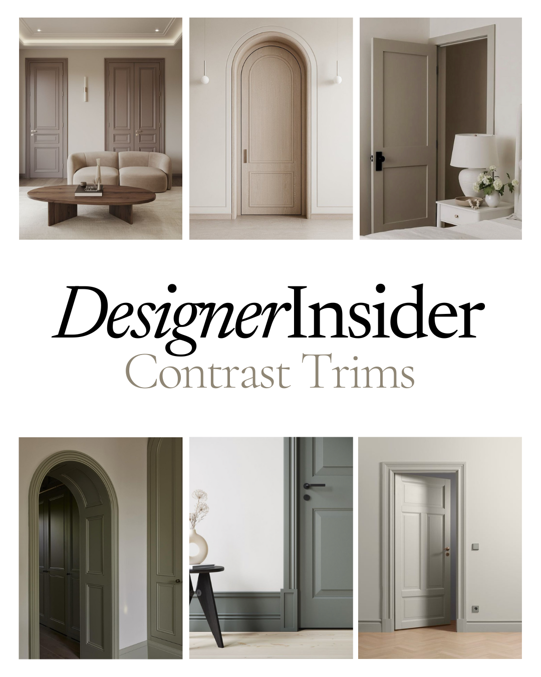
Why Contrast Doors & Trims are a look to love
If you’ve been scrolling Pinterest or flicking through the latest interior magazines, you may have noticed this feature quietly sweeping through stylish homes: contrasting dark doors and trims teamed with lighter toned walls. It’s a simple design move, but the effect is elegant, and modern. Here are 6 reasons I like the effect of this interior trick…
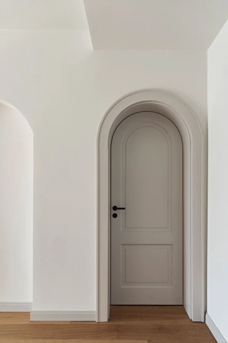
Image: MTM ARCHITEKTUR
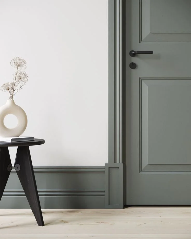
1. It Adds Sophistication Without Overcomplicating the Palette
Neutral walls have long been a go-to in interior design for their bright, clean, and timeless appeal. But pairing them with a darker neutral trim - think soft naturals, greige, greys and dusky greens - instantly elevates a space. The contrast brings in definition and polish, without having to commit to bold or overwhelming colour. You get the best of both worlds: a calm, neutral base with a little extra character and edge.
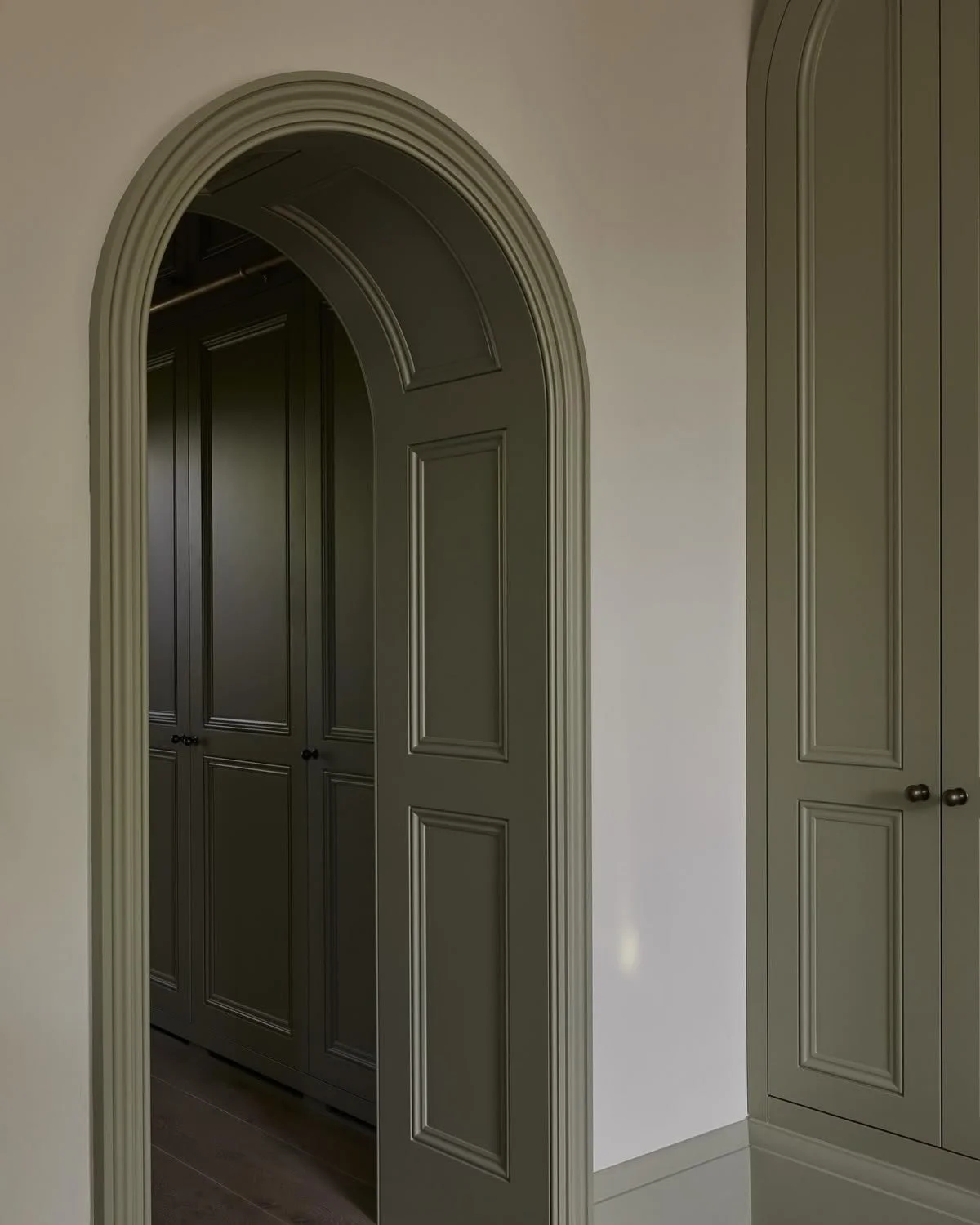
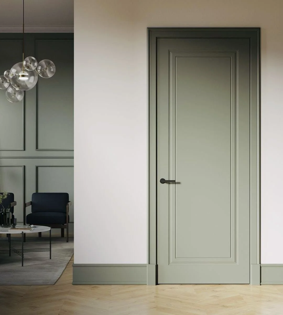
Image: Blank Slate Studio
2. It Highlights Architectural Details
In many homes trims, doors, and architraves are often beautiful features but when everything is painted white, they can visually disappear. By painting these elements in slightly darker shade, you’re drawing attention to the craftsmanship and shape of your home’s details. Think of it like eyeliner for your interior - it frames and accentuates the architecture beautifully.

3. It Hides Wear and Tear (Especially in Busy Homes!)
Let’s face it, white doors and trims take a beating - especially in family homes with kids, pets, or frequent visitors. Scuffs, fingerprints, and general wear show up quickly on white surfaces. Darker neutrals are much more forgiving. They’re practical and low-maintenance while still looking chic - especially in high-traffic areas like hallways, living rooms, and mudrooms.
Pro Tip:
Use the same paint colour but vary the strengths. Use the double strength of the paint colour for the doors and trims, and the half or quarter strength for the walls. This way you know the different tones match.
4. It Creates a Sense of Depth and Warmth
Using contrasting tones gives your space dimension. While all-white interiors can sometimes feel flat or sterile, layering in darker tones on the trims adds depth and warmth, making the home feel more grounded. This approach works beautifully with timber floors, stone features, and textured textiles - it complements the natural palette many New Zealand homes already have.
5. It’s a Versatile Look That Can Suit Any Style
You might think this trend is just for modern or minimalist interiors but it’s surprisingly flexible. From classic villas and bungalows to new builds, this trick adapts well. Just choose the right shade of neutral to match your home’s character.
In a heritage home, try a warm greige or olive green on the trims for a soft, lived-in elegance.
In a contemporary space, go for greys or naturals for a clean, tailored look.


6. It Feels Considered — Without Being Overdesigned
There’s something effortlessly stylish about this colour treatment. It feels intentional, considered, and grown-up - like someone took the time to really think about the space. But the best part? It’s easy and affordable to do. You don’t need to renovate the whole house, just the doors, skirtings, and architraves.
My Final Tip:
If you’re unsure where to start, try it in a single room — perhaps a hallway or bedroom. Choose a paint colour that has a slightly warm undertone to avoid things feeling too stark. And don’t forget to test the paint in natural and artificial light — those tones can shift!
Tones to try:
Warm Neutrals


Pale greens


Greiges


