
Artwork Layouts / A Designer’s Guide
Art isn’t just a finishing touch, it’s a powerful design tool. The right artwork (and the way it’s arranged) can add emotion, balance, scale, and colour to a room, and take a room from average to unmistakably you! Whether you’ve collected pieces over time or you're starting fresh, here are layout ideas to confidently arrange your art like a designer.
Artwork Layout Options
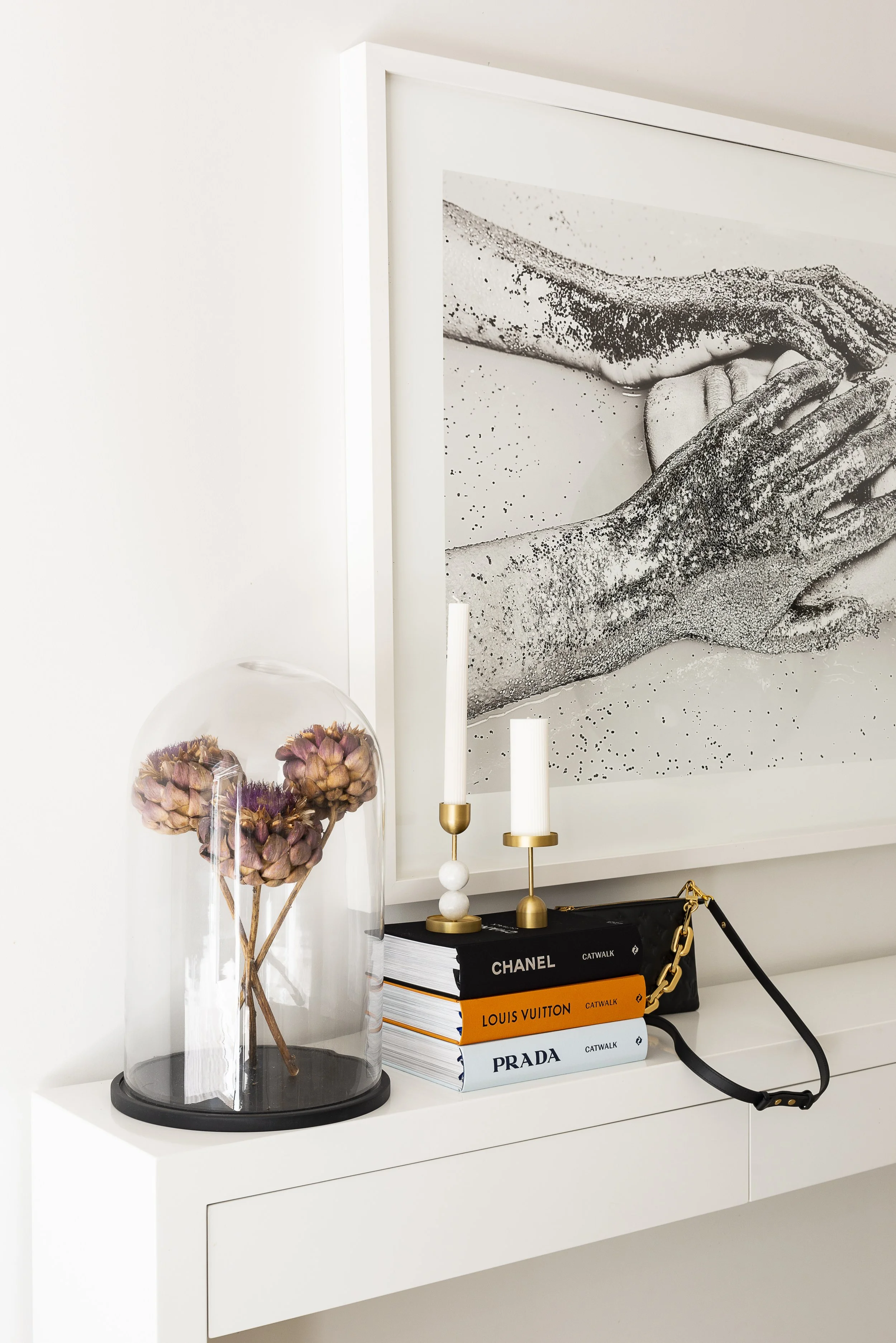
1. Perfect Pair
Pairing two symmetrical artworks creates visual balance on a large wall. Think: above a console, a bed, or flanking a fireplace.


2. The Trio (Triptych)
Three artworks that relate to each other in size, tone or subject are a timeless way to fill horizontal space. I love using a triptych over a dining banquette or sofa.


Pro Tip
Art comes alive with the right lighting. Picture lights, wall washers, or adjustable spotlights can make colours pop and details shine. Avoid direct sunlight on delicate works to prevent fading.
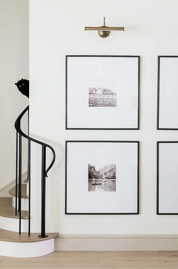
3. The Quad
Four artworks arranged in a grid or square formation are perfect for wide spaces like hallways or living rooms. Just make sure the spacing between each piece is consistent for cohesion.

4. Simple Grid
Great for related works like photography series or prints. Use consistent frames and mat-boards for cohesion.

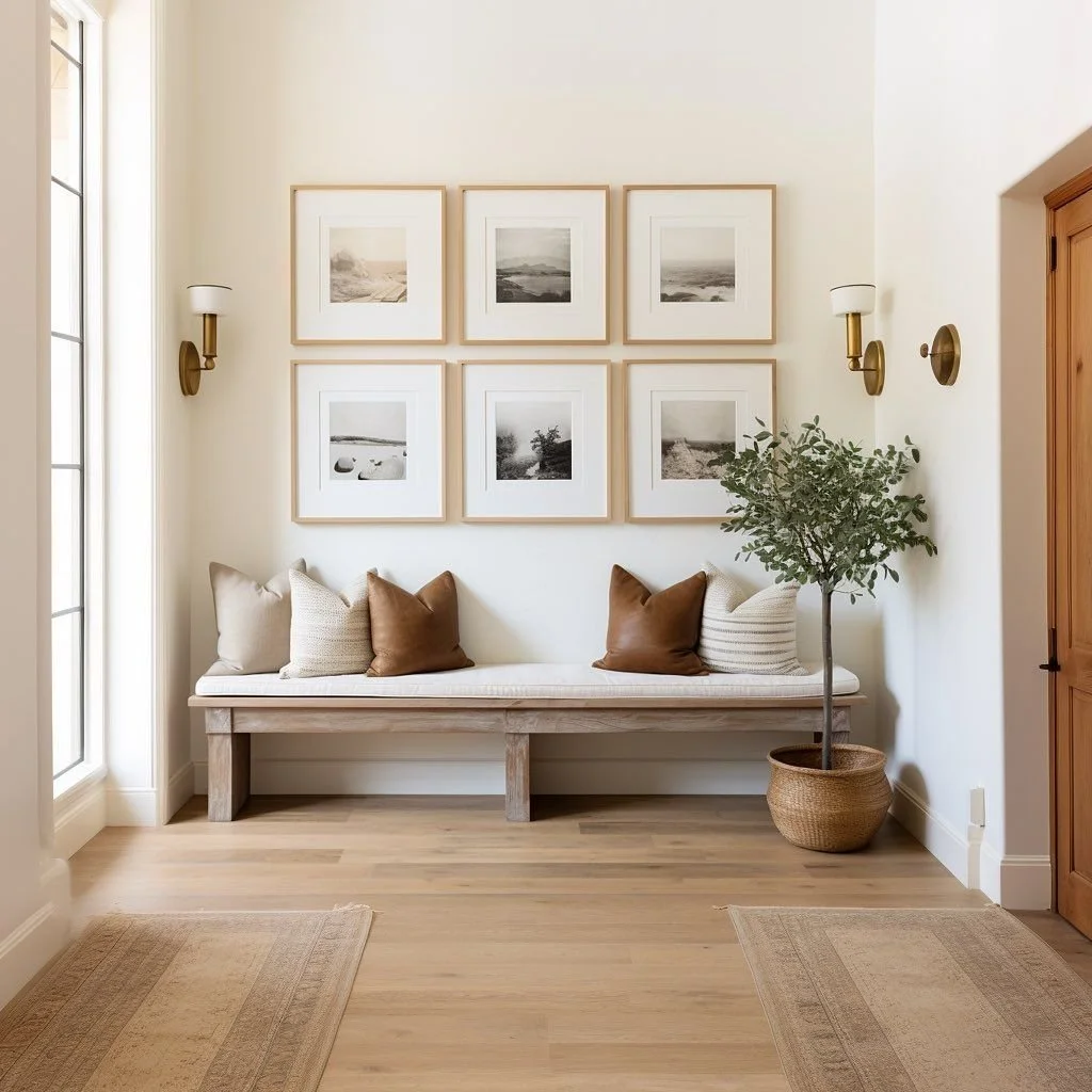
5. Classic Grid
For a more formal, tailored home, symmetry and equal spacing create a calm visual structure.

6. Grid Variation
Mix one larger piece with smaller works around it for a slightly more relaxed and casual arrangement.

Pro Tip
The biggest mistake I see? Hanging art too high. A good rule of thumb is to place the centre of the artwork at eye level, roughly 145–155cm from the floor. If you’re hanging above furniture, leave about 15–25cm between the top of the furniture and the bottom of the artwork.
7. Gallery Wall
The most personality-packed option. Mix frame sizes and artwork types with a loose sense of cohesion — tonal palette, theme or era. My favourite gallery wall fits into an overall shape — for example the below square — but you can play around with more haphazard edges if you want a more casual look.

8. Offset Gallery Wall
Mount your artwork around a visual centre point, staggered rather than symmetrical, for a more curated look.

Pro Tip
If you’ve invested in beautiful artwork, it’s worth hiring a pro to hang it perfectly. They’ll ensure clean fixings, accurate levels, and a polished finish that elevates your whole space.
9. Floating Shelf Display
Display smaller pieces by leaning them on a floating shelf. Easy to change over the seasons and years when you want a new look.

Studio Haus Co.
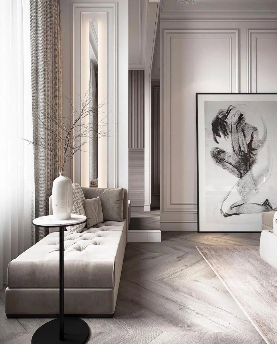
10. Leaning on the Floor
Large-format pieces can be leaned against the wall — great for entryways, bedrooms or informal styling. I really like this look — it reminds me of a cool New York artist’s loft studio!

Distance & Placement Guide
70–150mm between artworks in a grouping works well
1450–1525mm average hanging height is a good guide (adjust for ceiling and viewing angle)
150–200mm between bottom of art and top of furniture
Pro Tip
Find the centre of your arrangement and work outward for balance. Too much negative space and the artwork loses its connection.

Whether you’re styling a hallway, bedroom, or full gallery wall, art has the power to completely transform your home. Remember, while there are plenty of ideas there are no rules so let your approach to art reflect your style.