
How to Introduce an Accent Colour

Choose One Hero Piece
Start with a hero piece - one or two statement items to carry it. Think an armchair in a rich jewel tone, an oversized piece of art, or a rug with a colour story woven through it. Here I chose two Sancal Remnant lounge chairs in a textural deep green fabric to create a striking focal point without overwhelming the eye. The rug was custom designed to have dark green, light green and neutral facets, so it doesn’t make the foundation of the room too bright or heavy.

Then add small touches
Before you commit to bold walls or statement joinery, try introducing colour through moveable pieces — art, cushions, throws, candles, or accessories. These little pops act as colour testers for your home. The bonus? They’re easily swapped out when you want to change the mood with the seasons.

This Tan Arlidge sculptural art piece adds a pop of colour to the neutral walls.
Layer on Texture
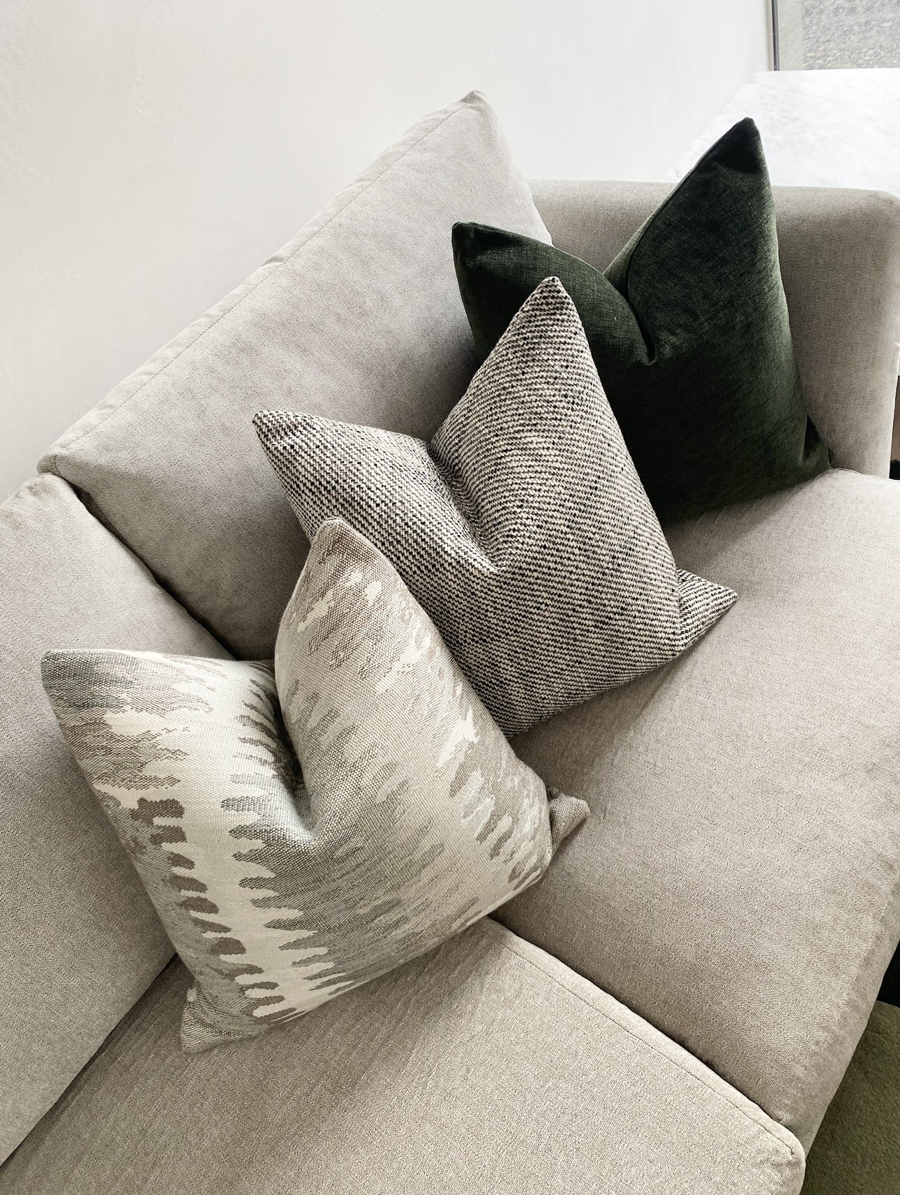
Texture is your secret weapon for softening strong colours. A velvet cushion in deep green or a boucle ottoman in warm terracotta feels tactile and inviting, while flat blocks of the same colour can feel more dominant. Layering texture with colour gives richness and depth. We had these cushions custom made in three very different fabrics that all contain a shade of green from dark to subtle.
Pro Tip
If you’re colour-curious but hesitant, try containing your accent to a smaller zone rather than across a large open plan space or entire floor. Powder rooms, alcoves, or the inside of shelving units are great places to play. The colour makes an impact, but the effect is cocooned, not overwhelming.
Balance with Neutrals
If you want to drench an entire room in colour go for it — I love this look if done well. However if you’re keen on a more caution approach, make neutrals the stage, and accent colours are the actors. When you add a bold hue, pair it with grounding neutrals—think soft greys, warm whites, or natural timbers. The colour can read more clearly when it has a calm backdrop.

Repeat in Small Doses
Finally, make your accent feel intentional by repeating it in at least three spots, and in different areas and heights. For example in this room we used lounge chairs, a rug, cushions, an artwork plus a view of greenery outside to repeat the colour. This repetition draws the eye around the room and creates a rhythmic harmony.

Try the 60–30–10 Rule
Here’s a helpful ratio to keep spaces balanced:
60% base colour (walls or large furniture)
30% secondary tones (flooring, rug, cabinetry, curtains)
10% accent colour (art, accessories, textiles)
Keeping your accent colour to around 10% of the space is the sweet spot—it stands out without stealing the show.
The Designer’s Takeaway
Introducing an accent colour doesn’t mean painting every wall or buying a sofa you’ll regret. It’s about editing—being strategic with where and how the colour appears, so it feels like an elevated detail rather than a takeover. With a few intentional touches, you can add the colour you love to your space without ever tipping into overwhelm.