Top Earth Tone Paint Picks
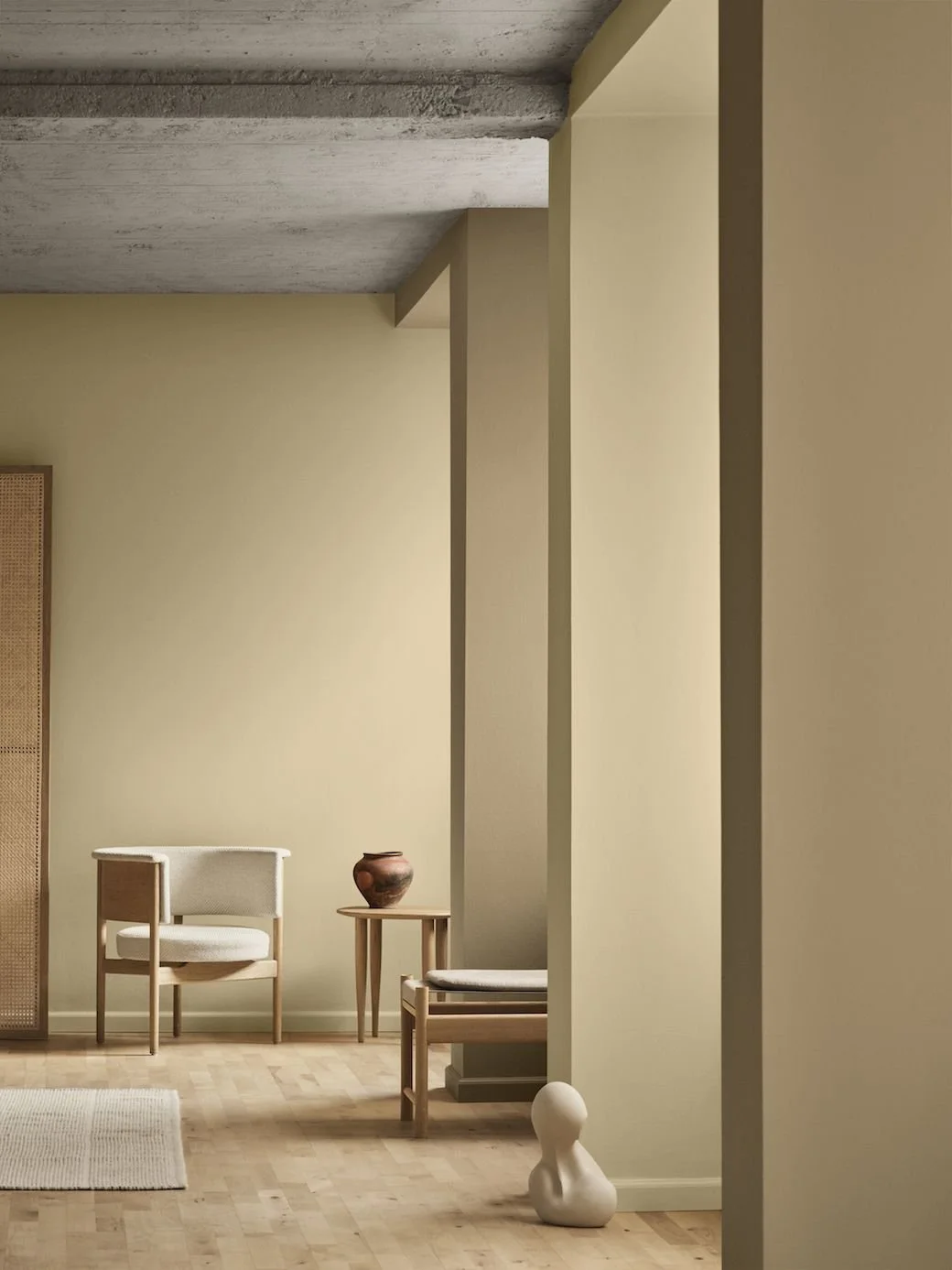
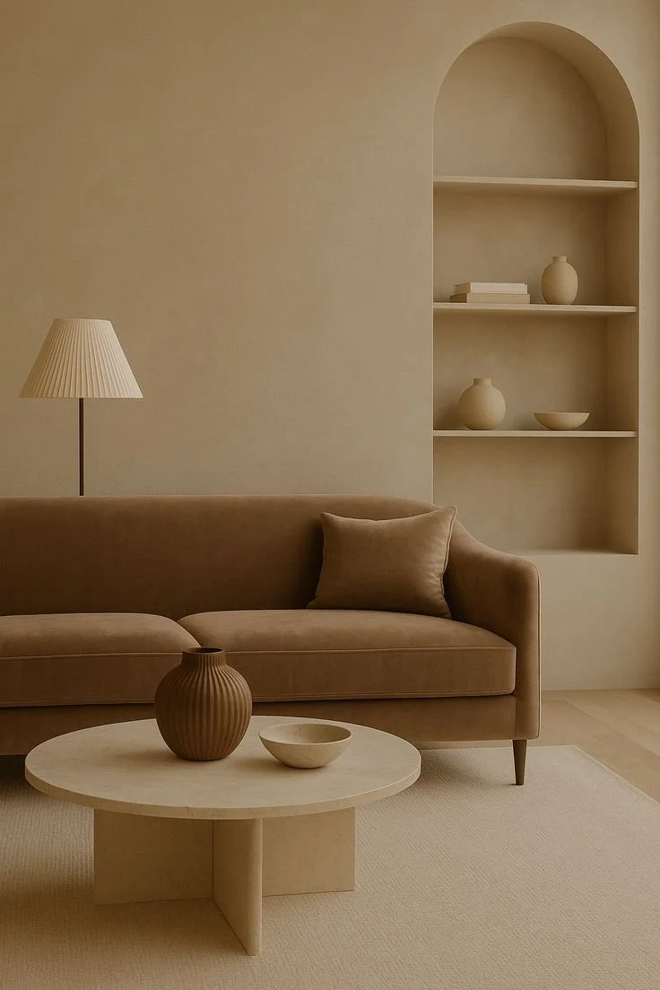
There's something incredibly comforting about earth tones. Inspired by the colours we see in nature - sun-baked clay, warm sand, ochre, stone and soil - they bring an immediate sense of warmth and grounding to an interior. While we often think of earthy colours as rustic or Mediterranean, they can actually feel incredibly sophisticated when used in the right way. The key is choosing shades with complexity: colours that feel slightly muddied, softened or chalky rather than overly bright or saturated.
To make navigating earth tone paint colours a little easier, I've broken my favourites down into four categories. First are the Sandy Neutrals, which offer warmth without obvious colour. Then come the Ochre & Gold tones, rich and grounding shades that work beautifully in contemporary homes. Next is Terracotta & Clay for those wanting warmth, richness and a more textural statement. And lastly Umber & Chocolate for deep, cocooning spaces.
PRO TIP: Consider your natural light before committing — earth tones can lean more orange in warm afternoon light and more brown or grey in cool, south-facing light, so always test a large sample on the actual wall. Shelley
These are the shades I'd reach for when I want to create an interior that feels warm, layered and connected to the natural world.
Soft Sand
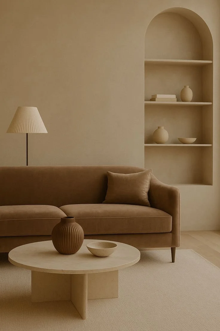
These are the colours I recommend when clients want warmth without obvious colour. They read as a neutral but bring a softness and depth that white simply can't achieve. These shades sit comfortably between warm neutral, taupe and earthy beige. They're understated enough to use across an entire room, but have enough pigment to create a sense of warmth and atmosphere.
PRO TIP: Earthy neutrals really come alive when they're layered rather than used in isolation. Instead of introducing lots of contrasting colours, try working within a tonal palette and creating interest through texture — timber, linen, wool, stone, handmade ceramics and woven fibres.
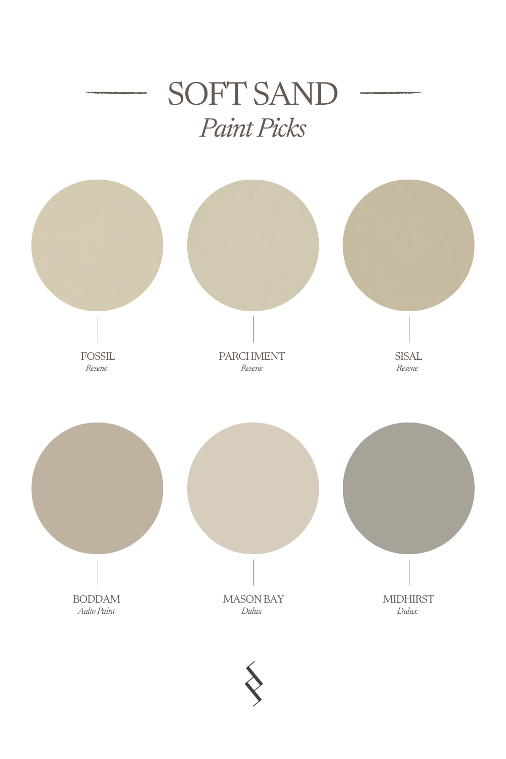
Top Soft sands
Resene Fossil A soft, warm neutral with an earthy undertone, more enveloping than a traditional off-white.
Resene Parchment A deeper sandy neutral that brings warmth without feeling yellow.
Resene Sisal A light beige neutral.
Aalto Boddam A blend of eight earthy pigments creating a warm, versatile neutral — highly liveable for interior schemes.
Dulux Mason Bay A wonderfully versatile warm neutral that works beautifully alongside timber and natural stone.
Dulux Midhirst A popular warm neutral with brownish-grey undertones — ideal as a main wall colour inside and out.






Terracotta & Clay
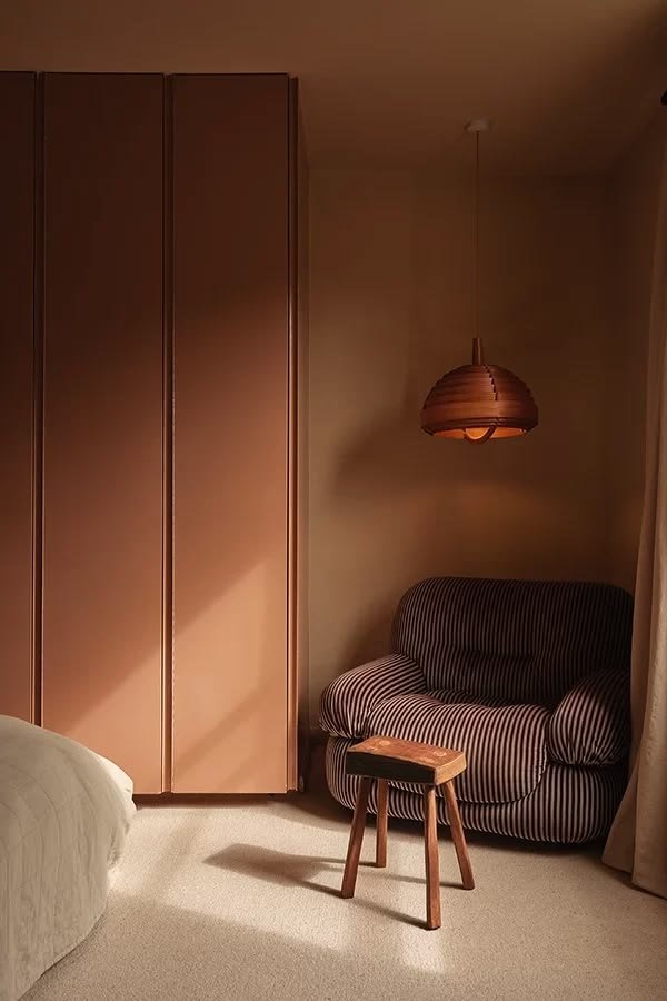
Clay tones have become increasingly popular in interiors, but for me they're much more than a trend. These colours have been used in architecture and interiors for centuries because they're inherently connected to the earth. The most liveable versions aren't necessarily bright orange terracottas. I tend to gravitate towards softer, muddier shades with brown, pink or rust undertones. For clients wanting a genuine statement, terracotta and clay tones bring warmth, richness and a sense of the Mediterranean or Tuscan countryside into a New Zealand home.
PRO TIP: Try different strengths of the terracottas and clays you like most — there's a lot of variation between eighth, quarter, half and full strength, and chances are your perfect match can be found somewhere in between. — Shelley
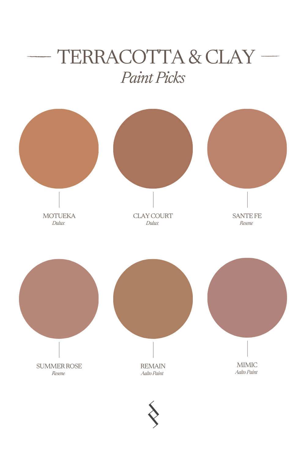
top Terracotta & Clays
Dulux Motueka A warm, earthy shade with a beautiful sun-baked quality.
Dulux Clay Court A softened clay tone that adds warmth and character without overwhelming a room.
Resene Sante Fe A soft TexMex terracotta.
Resene Summer Rose A muted terracotta beige, faded with antiquity.
Aalto Remain Richly coloured with ten pigments, an earthy orange hue that creates a sense of warmth and vitality.
Aalto Mimic A deep rose pink with undertones of terracotta.






Ochre & Gold
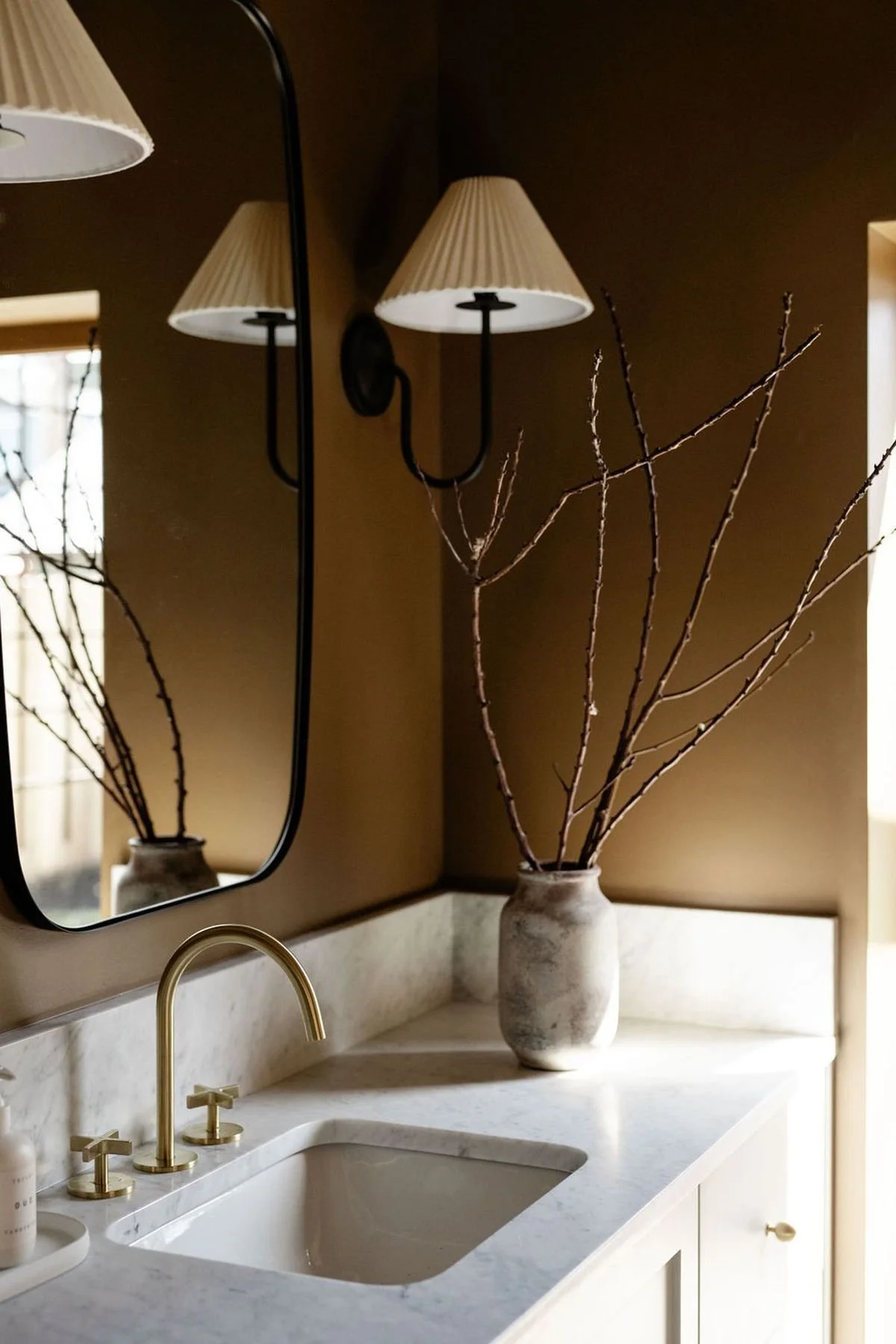
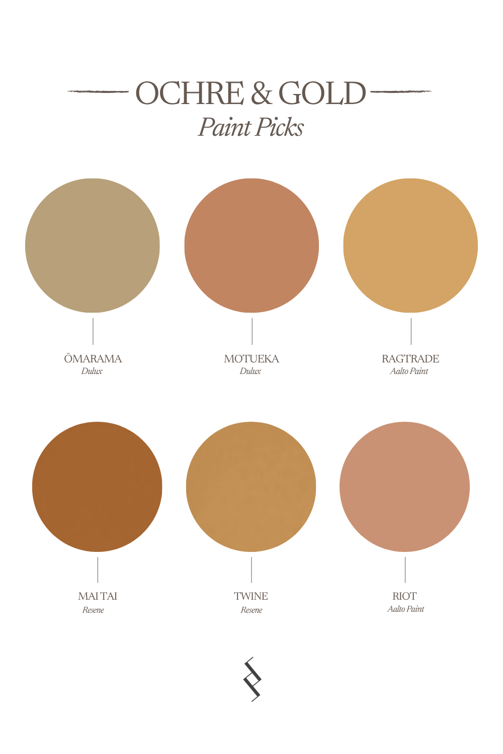
Ochre is one of those colours that can initially feel quite bold on a paint chart, but in the right interior it can be incredibly sophisticated. Rather than bright yellow, look for ochres with plenty of brown, clay or mustard in their base. These warmer, muddier undertones make them much easier to live with. These stronger earth tones can be particularly beautiful in smaller spaces, where you can embrace their intensity rather than trying to dilute it.
Resene Dusted Blue
top Mid Blues
Dulux Ōmarama A soft tan that adds a touch of warmth to any space.
Dulux Motueka A warm, earthy shade with a beautiful sun-baked quality.
Aalto Ragtrade A golden tone enriched with orange, yellow and violet pigments, creating a sense of comforting warmth.
Resene Mai Tai A delicious fillip of red gold and amber.
Resene Twine A camel brown, fibrous and strong.
Aalto Riot An earthy burnt-orange tone that embodies a sense of warmth and vitality.






Umber & Chocolate
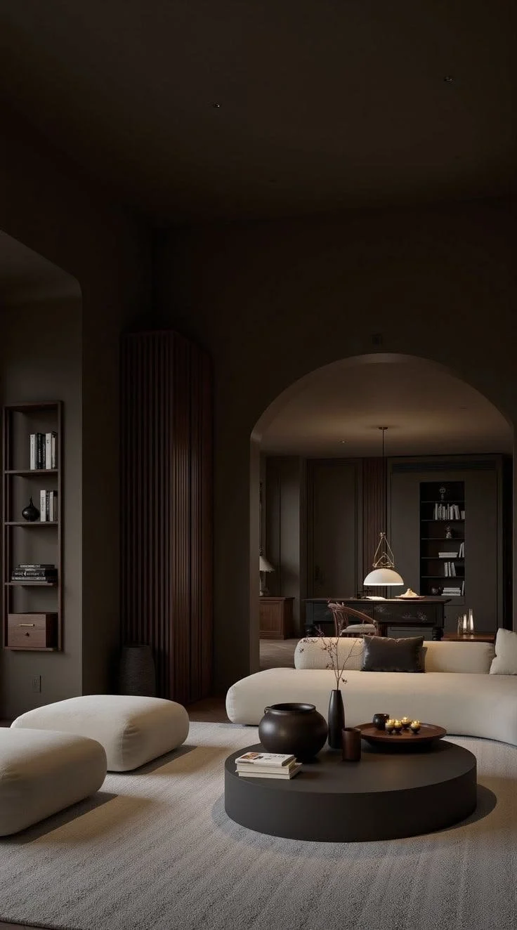
These deep, earthy browns create atmosphere and cocooning warmth — perfect for studies, powder rooms and spaces where you want a little more drama and depth.
best Moody Blues
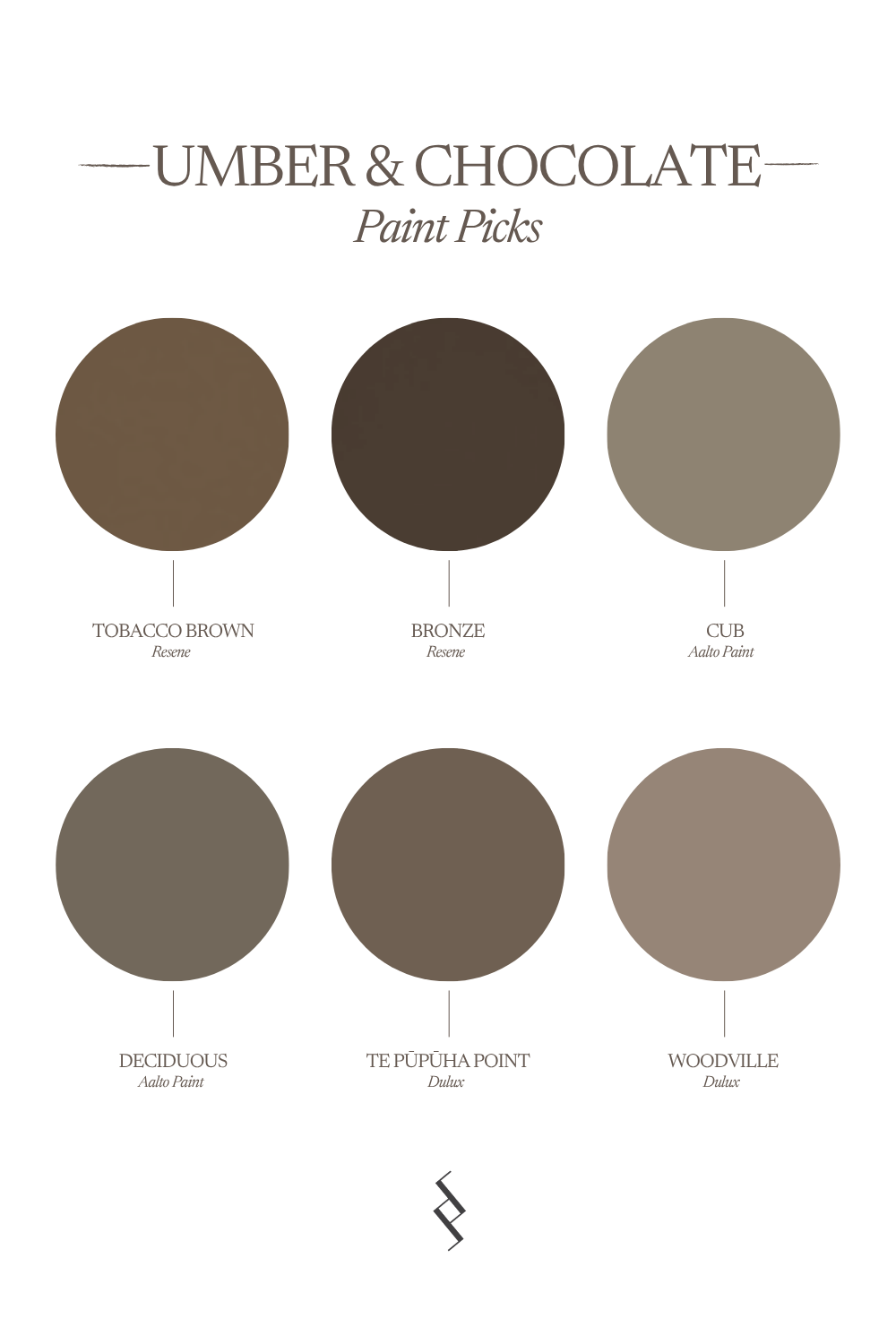
Resene Tobacco Brown A warm, smoky brown oxide.
Resene Bronze A raw, martial brown — staunch and serious.
Aalto Cub A warm brown created by layering nine pigments — a versatile neutral.
Aalto Deciduous A richly pigmented brown that brings warmth and a sense of stability, creating a cozy ambiance.
Dulux Te Pūpūha Point A complex warm brown with red undertones.
Dulux Woodville A midtone warm brown with subtle red undertones, lovely for walls inside and out.






PRO TIP: Always test large paint samples in morning, afternoon and evening light. Brown undertones can shift dramatically depending on orientation and natural light. Shelley
Where I Use Earth Tones
One of the things I love most about this palette is its versatility. In an entry hall, an earthy paint colour immediately creates warmth and gives you a sense of arrival. In a powder room, you can afford to be more adventurous. These are spaces we spend short periods of time in, so deeper clay, ochre and terracotta shades can create a great sense of drama! For bedrooms, I prefer the softer end of the spectrum, sandy neutrals, muted clay and warm stone shades that make the room feel cocooning and calm. Earth tones are also perfect for holiday homes and coastal interiors. Rather than relying on obvious blues and whites, colours drawn from sand, rock, clay and the surrounding landscape can create a natural grounding feel.
Pairing Earth Tones With Materials
Earth-toned paint colours work best when they're paired with materials that share the same natural quality.
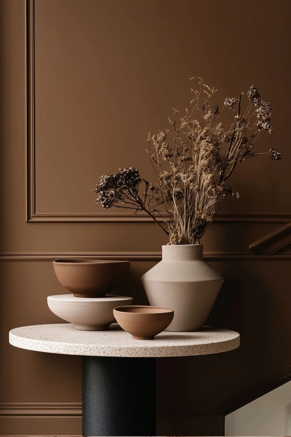
Some of my favourite combinations are:
Travertine and limestone
Warm oak and other natural timbers
Linen and textural woven fabrics
Aged brass and bronze
Handmade or imperfect ceramics
Natural wool and sisal
Soft plaster and limewash-style finishes
The aim isn't to make everything brown or beige. It's about building layers of related colours and textures so the interior feels collected, tactile and relaxed. I particularly love adding small amounts of contrast through deep chocolate brown, blackened bronze or dark timber, which can stop an earthy palette from becoming too washed out.
Choosing the Right Earth Tone
As with any paint colour, the light in your room will have a huge impact on how an earth tone reads.
In rooms with cooler or south-facing light, warmer sandy, clay and terracotta tones can help counteract that coolness and make the space feel more inviting.
Rooms with plenty of warm northern light can generally handle muddier or deeper shades without them feeling heavy.
Always test your paint colour in the actual room before committing. Paint a generous sample and look at it throughout the day — morning, afternoon and evening — and alongside the flooring, stone, timber and fabrics you're planning to use.
Earth tones are particularly responsive to their surroundings, which is part of what makes them so beautiful.
When you find the right one, they have a way of making a room feel instantly warmer, calmer and more connected to nature — and that's a feeling that never really goes out of style.
MORE LIKE THIS