Top Blue Paint Picks

Blue remains one of my favourite colours to use in interiors because it can feel both calming and sophisticated. The key is choosing blues that have enough grey in them to feel timeless rather than trendy. Depending on the tone, blue can feel coastal, classic, contemporary, moody or quietly luxurious. To make navigating blue paint colours a little easier, I've broken my favourites into four categories.
First are the Barely-There Blues for those wanting the softest hint of colour. Next come the Aquas, perfect for coastal homes and spaces that need a fresh, uplifting feel. Then there are the Mid Blues, my most-used category for cabinetry and statement moments. Finally, I've included the Moody Blues – deeper shades that create drama, sophistication and depth.
PRO TIP: Remember to consider your natural light - South-facing homes often benefit from warmer blues, and North-facing homes can comfortably handle cooler blues. Shelley
Barely-There Blues
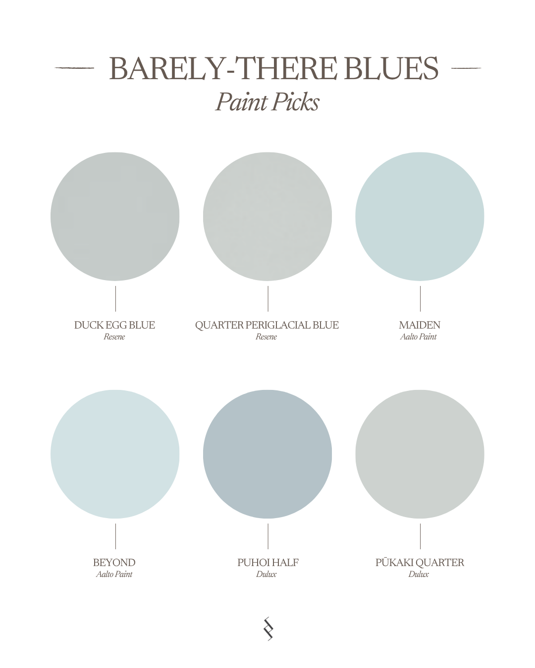
These are the blues I recommend to people who think they don't like blue. Soft, subtle and often reading almost as a neutral, they add a gentle layer of colour without dominating a space.

Top BARELY-THERE
Resene Duck Egg Blue (or Half Strength) A pale shell blue, crystalline and calm, reflecting winter skies over the sea.
Resene Quarter Pereglacial Blue A softly smoked blue with a touch of green.
Aalto Maiden A pale blue, infused with warmth and serenity.
Aalto Beyond Earthy pigments create complexity within Aalto Beyond, a clear sky blue.
Dulux Puhoi Half A light blue with a greyish undertone that is great for both interiors and exteriors.
Dulux Pukaki Quarter A soft blue with grey undertones making it a popular choice for bathrooms, laundries and bedrooms with good natural light.

Resene Duck Egg Blue

Aalto Beyond

Resene Quarter Pereglacial Blue

Dulux Puhoi Half

Aalto Maiden

Dulux Pukaki Quarter
Soft Aquas
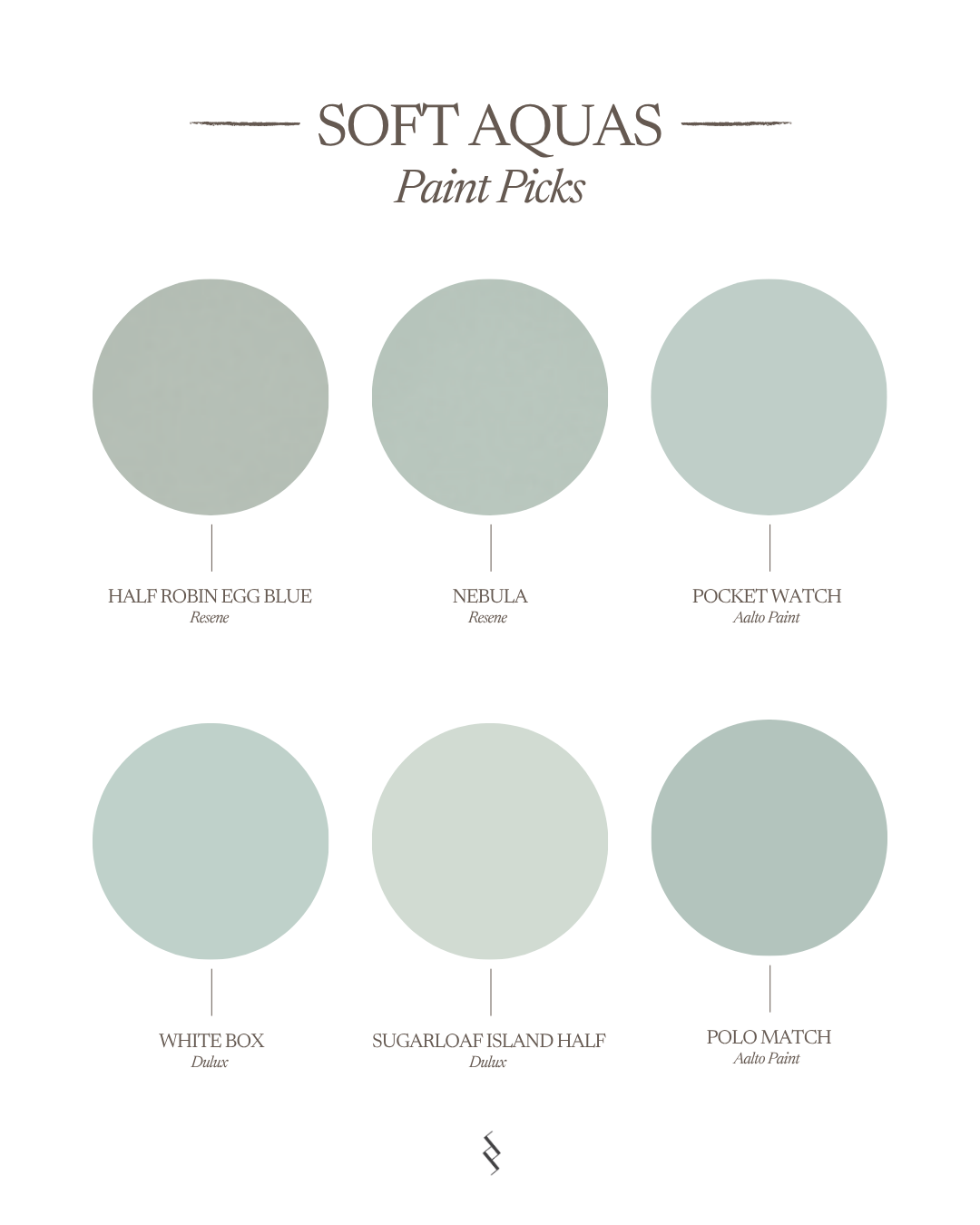
Aquas bring a fresh, coastal energy to a home. They work beautifully in beach houses, powder rooms and bathrooms, adding colour while still feeling light and relaxed.
PRO TIP: Paint your entire interior the same blue, including ceilings, skirtings, architraves and doors to create a more colour-drenched, cocooning look in a room. Vary the sheen levels for practicality, like semi-gloss for frames and doors and ceiling paint tinted to your chosen blue for ceilings.

top Soft Aquas
Resene Half Robin Egg Blue A smoky soft green blue, washed soft.
Resene Nebula A cloudy patch of light blue.
Aalto Pocket Watch A soft, duck egg green hue that evokes a sense of peace and tranquility; perfect used in bedrooms.
Dulux White Box A lighter, muted blue-green.
Dulux Sugarloaf Island Half This soft light minty blue is great for bathrooms, kitchens or bedrooms. It is also ideal for pairing with darker blue-greens.
Aalto Polo Match Reminiscent of summer days by the pool, this coastal-inspired hue is serene and calming.

Resene Half Robin Egg Blue

Dulux White Box

Resene Nebula

Dulux Sugarloaf Island Half

Aalto Pocket Watch

Aalto Polo Match
Mid Blues
This is the category I use most often. Mid blues have enough depth to create a feature without feeling overwhelming. They work beautifully on cabinetry, kitchen islands, studies and bedrooms.
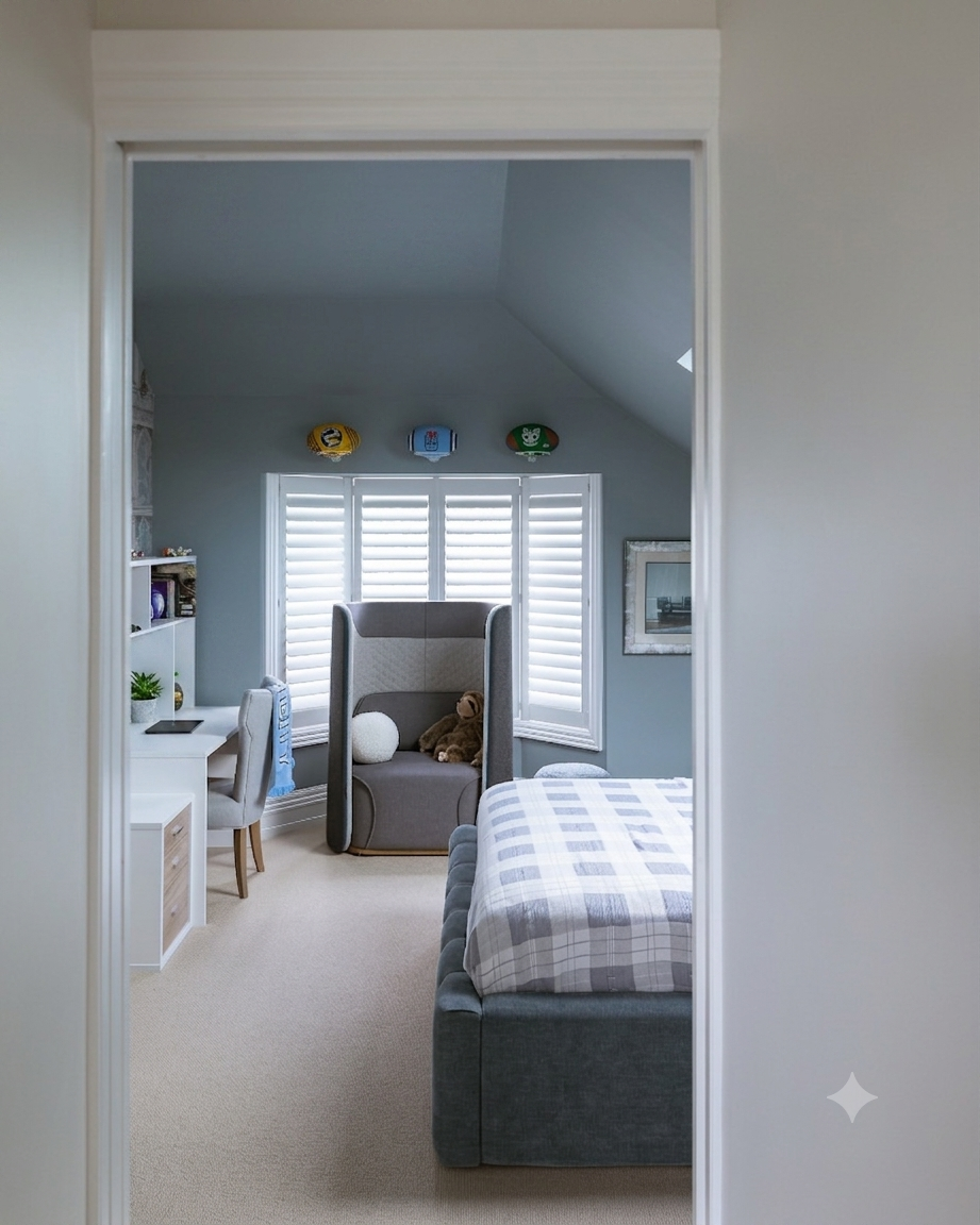
Resene Dusted Blue
top Mid Blues
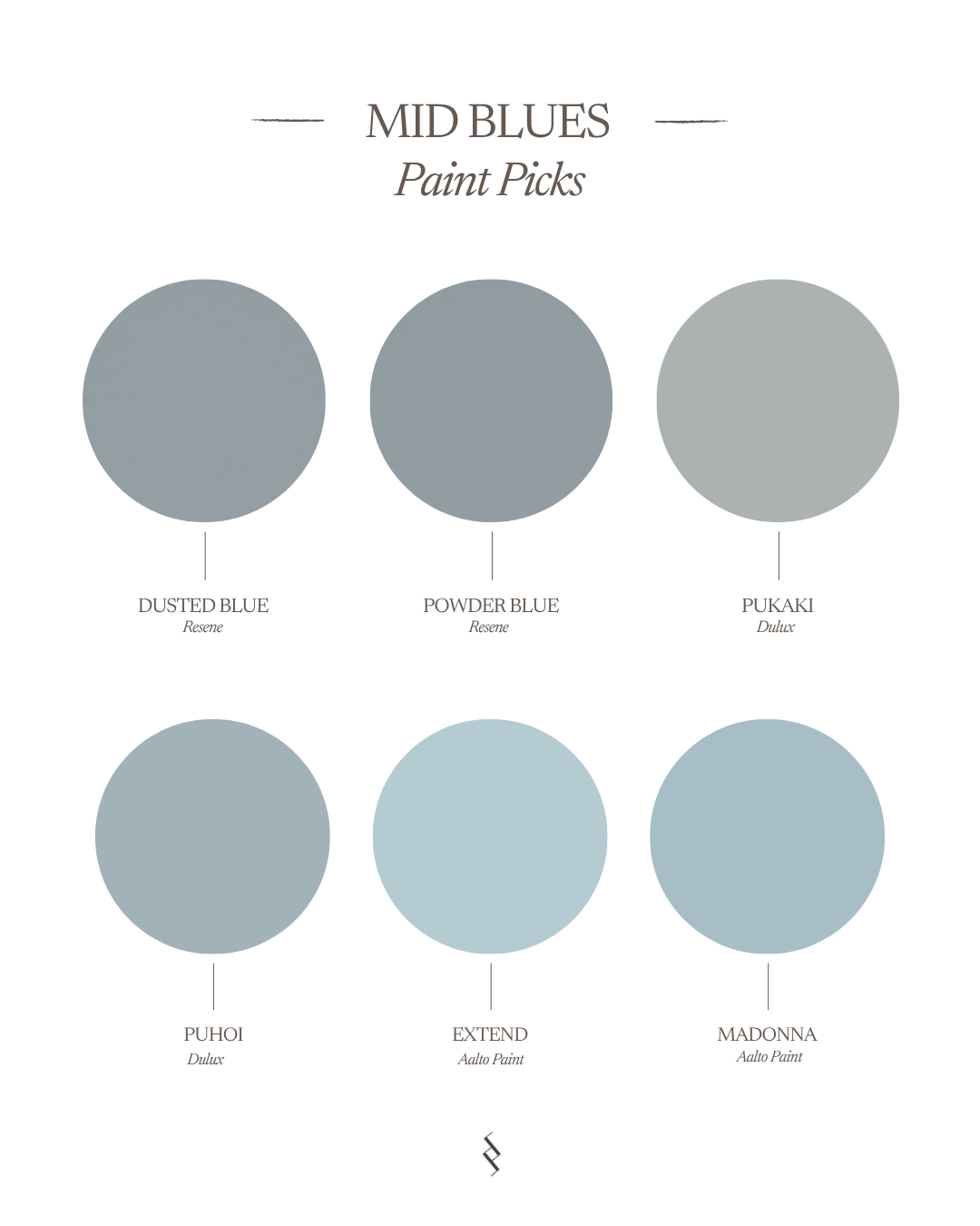
Resene Dusted Blue A pale grey, bleached by age and slightly blue in mood.
Resene Powder Blue An antiqued steel blue.
Dulux Pukaki A complex soft grey with blue undertones.
Dulux Puhoi A popular and timeless blue with a greyish undertone.
Aalto Extend A soft powder blue, perfect for creating a traditional colour scheme.
Aalto Madonna A soft, antique blue, reflecting its associations with the calmness of the sea and the sky.






Moody Blues
These deeper blues create atmosphere and sophistication. They are ideal for media rooms, studies, powder rooms, bars and statement joinery and create a feeling of being enveloped in a room. They are dark, so be mindful of the natural and artificial light in the room and test them well first.
PRO TIP: Try different strengths of the blues you like most – there’s a lot of variation between eighth, quarter, half and full strength and chances are your perfect match can be found somewhere in between. Shelley
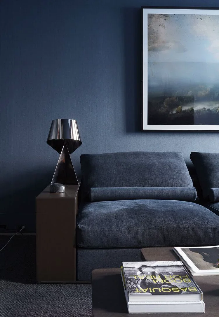
best Moody Blues
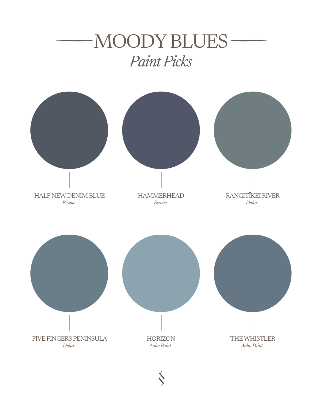
Resene Half New Denim Blue A handsome dark charcoal blue.
Resene Hammerhead A steely blue, intrepid and staunch.
Dulux Rangitikei River A deep, inky blue with a hint of green, moody and dramatic.
Dulux Five Fingers Peninsula A popular dark and moody blue with a greyish undertone.
Aalto Horizon A touch of 90’s nostalgia, this is a modern interpretation of the classic silver-blue popularised by Jaguar and Austin-Healey in the 1960s.
Aalto The Whistler A slate-toned blue grey that is muted yet rich, bringing tranquility and depth.

Resene Half New Denim Blue

Dulux Five Fingers Peninsula



Dulux Rangitikei River

Aalto The Whistler
PRO TIP: Always test large paint samples in morning, afternoon and evening light. Blue undertones can shift dramatically depending on orientation and natural light. Shelley
How To Use Blue
Where i use blue
Powder rooms
Studies
Media rooms
Bedroom headboards
Kitchen islands
Built-in cabinetry
Choosing The Right Blue
Overall Style
Coastal: Aquas or Mid Blues
Modern European: Mid Blues or Moody Blues
Contemporary: Barely-There Blues or Mid Blues
Traditional: Mid Blues
Organic Modern: Mid Blues with warm neutrals
PAIRING MATERIALS
Natural oak or walnut
Travertine
Limestone
Brass
Bronze
Warm whites
Natural Light
South-facing rooms often suit warmer blues.
North-facing rooms can comfortably handle cooler blues.
MORE LIKE THIS